Creating a calming bedroom starts with color. Neutral palettes bring peace to your space without feeling boring or sterile. These shades—from warm taupes to cool grays—work together to promote relaxation and better sleep. You don’t need a complete renovation or expensive designer pieces. Small changes like swapping pillowcases, adding texture, or painting an accent wall can transform your room. The right neutral combination helps your mind unwind after long days. Ready to discover palette ideas that actually work? Let’s explore 22 combinations that bring style and serenity to any bedroom.
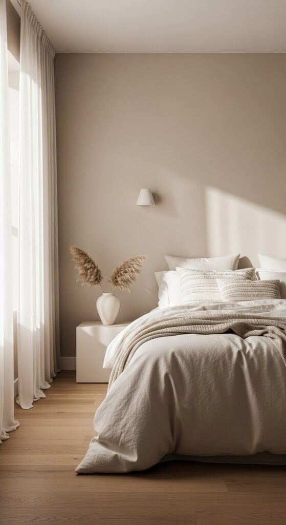
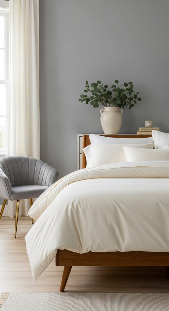
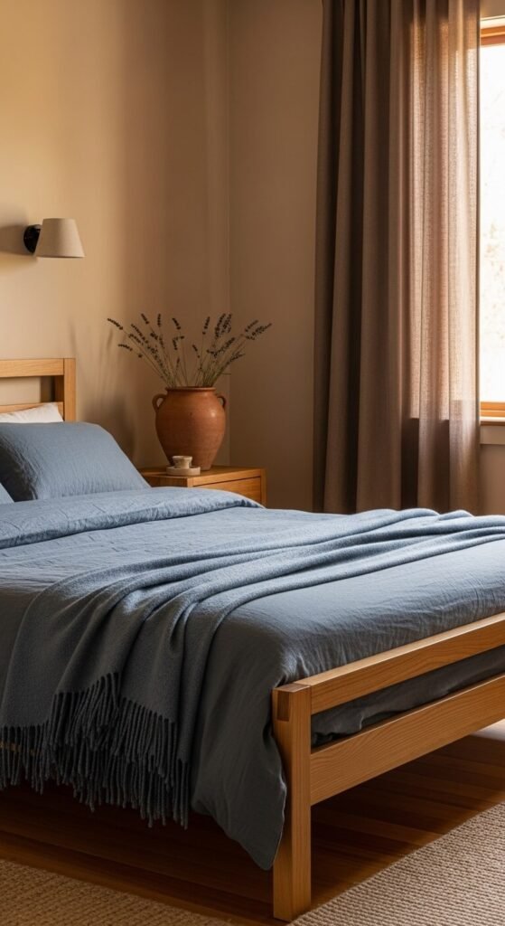
Warm Taupe and Cream Dream
Taupe creates warmth without overwhelming your senses. Pair it with cream bedding for instant coziness.
Paint three walls taupe and keep one cream as an accent. This breaks up the space visually. Layer different cream shades in your pillows and throws. Mix textures like linen, cotton, and faux fur.
Budget tip: Buy taupe paint from discount bins at hardware stores. Cream fabric remnants from craft stores work perfectly for DIY pillow covers. Thrift stores often have cream-colored frames you can spray paint taupe.
This palette works in any sized room. Add wooden furniture to complete the look.
Greige with Soft White Accents
Greige blends gray and beige for perfect balance. White accents keep things from feeling too heavy.
Use greige on walls and white for trim work. Choose white sheets and a greige duvet cover. This creates clean lines that feel intentional.
DIY idea: Paint existing dark furniture with greige chalk paint. Add white ceramic knobs for contrast. Hang white curtains to frame windows.
The combination photographs beautifully and hides dirt better than pure white. Perfect for busy households or pet owners. Add plants in white pots for life.
Soft Gray and Ivory Harmony
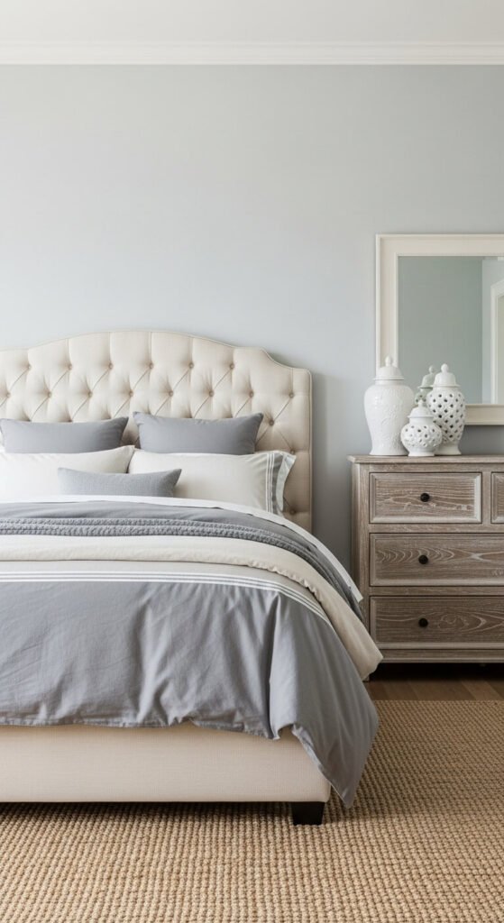
Gray doesn’t have to feel cold. Pair it with ivory for a softer approach.
Choose warm gray paint with subtle brown undertones. Layer ivory bedding on top. Mix in gray throw pillows and blankets.
Budget hack: Gray fabric dye transforms old white sheets. Ivory curtain panels from discount stores look expensive when properly hung. Cardboard spray-painted gray makes cheap wall art.
This palette adapts to seasons easily. Switch out accessories without repainting. Gray handles color additions well if you change your mind later.
Mushroom and Oat Combination
Mushroom brown brings earthiness without darkness. Oat tones add lightness and texture.
Paint walls mushroom and use oat-colored fabrics throughout. The contrast stays subtle but interesting. Add wooden elements in medium tones.
Affordable approach: Mix your own mushroom paint by adding brown to beige base paint. Oatmeal-colored sheets cost less than designer neutrals. Collect free branches and arrange in thrifted vases.
This combination feels organic and grounding. Great for people who struggle with sleep anxiety. The colors naturally calm racing thoughts.
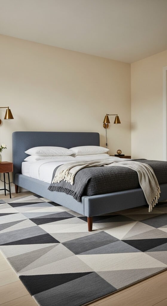
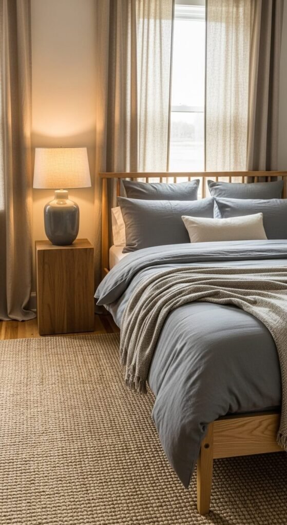
Cool Gray and Warm Beige Balance
Mixing warm and cool neutrals creates dynamic interest. This prevents flat, boring spaces.
Paint one wall cool gray as a focal point. Keep other walls warm beige. Mix metal finishes in your lighting and hardware.
Money-saving tip: Sample pots of paint work for small accent walls. Spray paint existing lamp bases in different metallic finishes. Frame fabric swatches as instant artwork.
The temperature contrast adds depth perception. Your room feels larger and more designed. Change throw pillow covers seasonally to shift the mood.
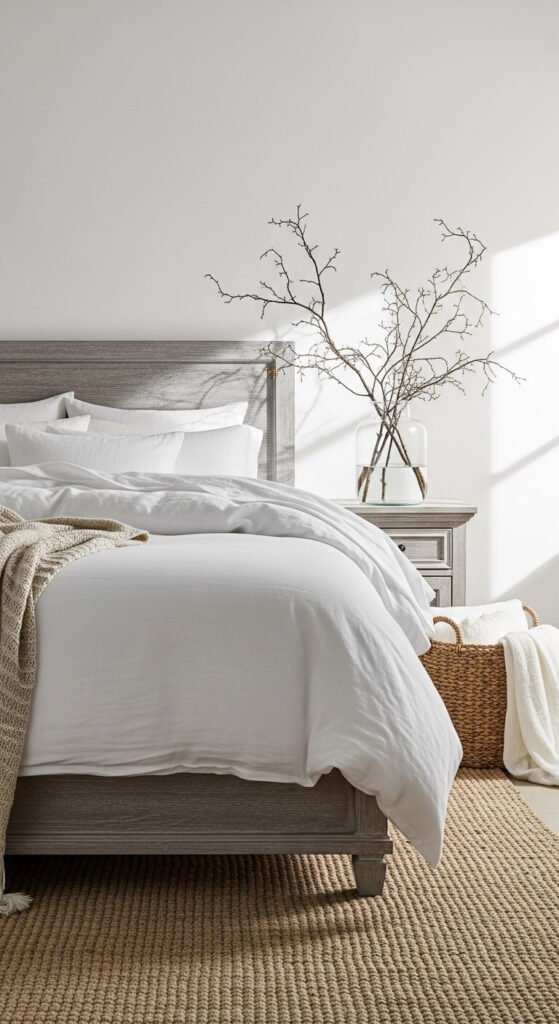
Cream and Natural Wood Foundation
Wood grain adds pattern without busy prints. Cream provides the perfect backdrop.
Keep walls cream and bring in wood furniture. Different wood tones actually work together. Mix light oak with darker walnut pieces.
DIY option: Sand and oil existing furniture to reveal natural wood. Cream fabric paint refreshes old lampshades. Stick-on wood veneer updates flat surfaces cheaply.
This combination never goes out of style. Wood tones warm up cream’s potential coldness. Add texture through woven baskets and natural fiber rugs.
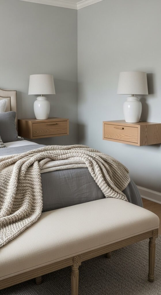
Dove Gray and Linen White Layers
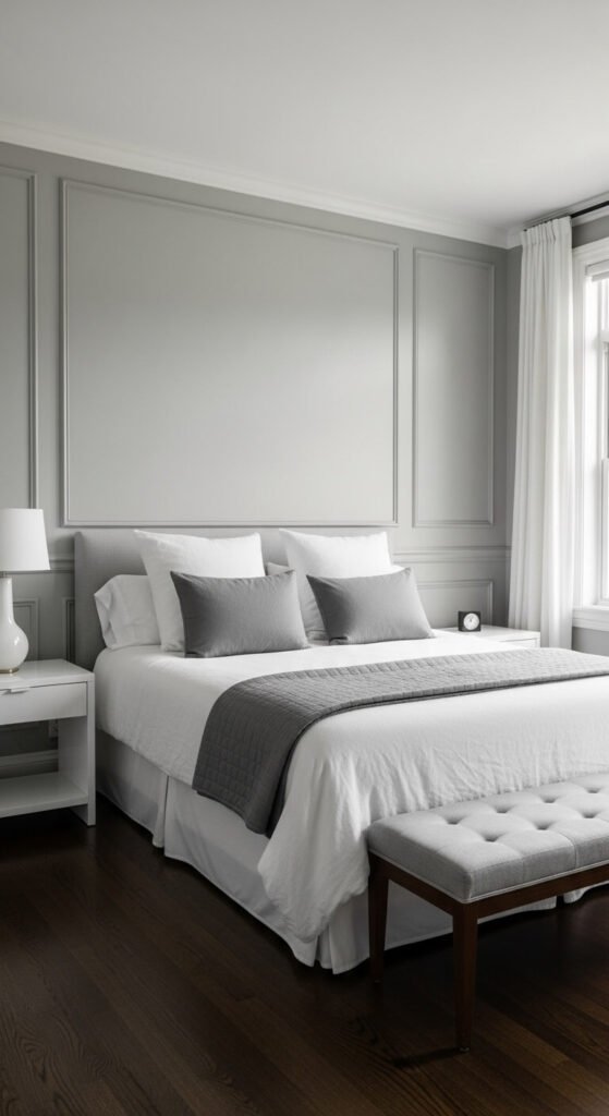
Dove gray feels sophisticated and peaceful. Linen white adds organic imperfection.
Paint walls dove gray and keep all trim bright white. Choose rumpled linen bedding in white. Don’t iron it—the wrinkles add character.
Budget-friendly: White trim paint costs less than colors. Linen-look polyester blends provide the aesthetic for less money. Gray contact paper updates furniture surfaces temporarily.
This palette works in rentals since it’s not permanent. The white trim brightens darker rooms naturally. Photographs show clean and modern.
Sand and Stone Simplicity
Sand tones reference beaches and relaxation. Stone gray grounds the softness.
Use sandy beige as your base color. Add stone gray through bedding and accents. Keep furniture simple and low-profile.
Cheap tricks: Beach sand in clear jars creates free decor. Gray concrete planters cost little at garden centers. Paint existing art frames in coordinating tones.
This stripped-back approach reduces visual clutter. Fewer items mean easier maintenance. Your brain relaxes when surroundings stay simple.
Almond and Slate Modern Mix
Almond brings warmth with modern edge. Slate gray adds contemporary sophistication.
Paint walls almond and invest in a slate gray bed frame. Mix modern and traditional pieces freely.
Affordability hack: Almond paint often goes on clearance. Slate gray slipcovers transform old headboards. Geometric patterns from dollar store wrapping paper make wall art.
This palette bridges different style preferences. Works for couples with different tastes. Modern enough for young spaces, classic enough for mature rooms.
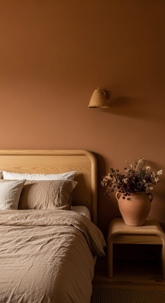
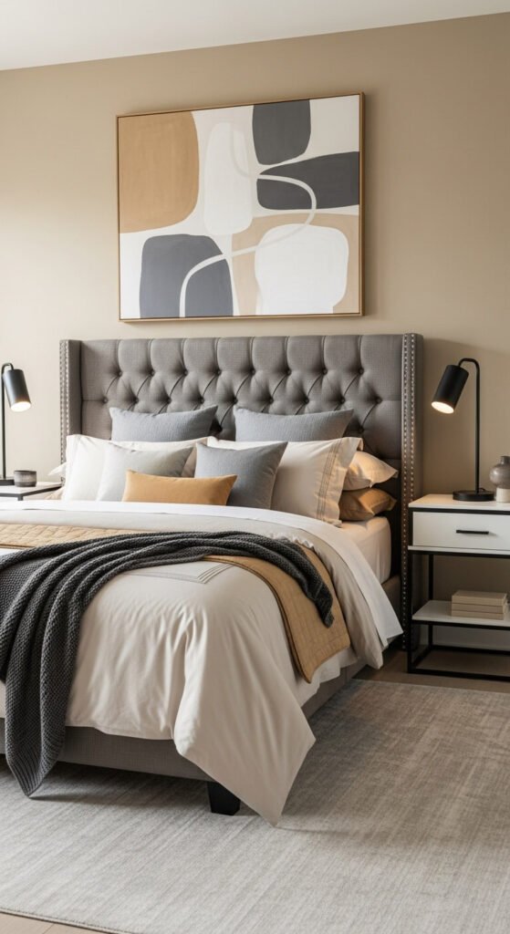
Biscuit and Charcoal Contrast
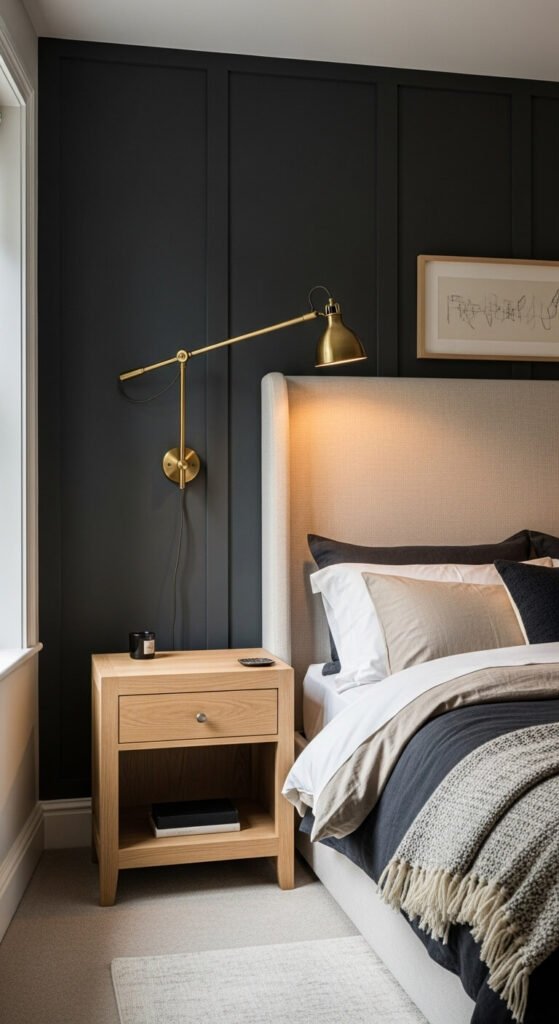
Biscuit yellow-beige adds sunny warmth. Charcoal provides dramatic grounding without being black.
Use biscuit as your main color and charcoal for one accent wall. The contrast creates a focal point naturally. Keep bedding mostly light with charcoal accents.
Budget version: Biscuit tones hide wall imperfections better than white. Charcoal fabric paint updates existing curtains. Group mismatched frames painted charcoal for gallery walls.
This combination photographs beautifully for social media. The drama stays bedroom-appropriate and calming. Adjustable for personal comfort levels.
Pearl and Putty Softness
Pearl white shimmers subtly in changing light. Putty adds depth without strong color.
Paint walls pearl white with slight sheen. Choose putty-toned larger furniture pieces. Layer whites and putties in fabrics.
Inexpensive ideas: Pearl finish comes from eggshell paint sheen. Putty-colored canvas dropcloth makes custom duvet covers. Paint existing hardware with metallic finishes.
This palette feels expensive and custom. Light reflects beautifully throughout the day. Small rooms appear larger and airier.
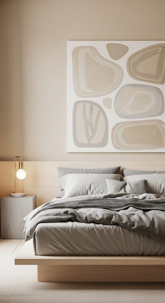
Pebble Gray and Vanilla Cream
Pebble gray has subtle warmth. Vanilla cream adds just enough yellow undertone.
Use pebble gray on walls and vanilla cream for all textiles. Mix in mid-century furniture for retro appeal.
Money-saving: Pebble rocks from landscaping stores inspire custom paint mixing. Vanilla extract adds subtle scent to unscented candles. Gray velvet fabric remnants cover throw pillows cheaply.
This combination works in north-facing rooms that need warmth. The yellow undertones compensate for less natural light. Stays calm while preventing coldness.
Cappuccino and Fresh Linen
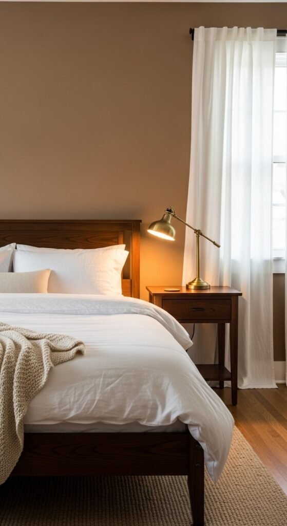
Cappuccino brown creates cozy cocoon vibes. Fresh linen keeps things from feeling heavy.
Paint walls cappuccino and use crisp white linens everywhere. The contrast stays clean and inviting. Add warm wood furniture.
Budget approach: Coffee-stained fabric creates DIY cappuccino tones. White flat sheets work as duvet covers. Dark stain transforms cheap pine furniture.
This palette works beautifully in cold climates. The brown feels warming and protective. White linens wash easily and last forever.
Fog Gray and Butter Cream
Fog gray disappears into peaceful ambiance. Butter cream adds gentle warmth.
Choose fog gray for walls and butter cream for accents. Layer textures to prevent flatness. Keep patterns minimal or absent.
Cheap fixes: Fog rolling technique creates custom gray paint effects. Butter-colored fabric dye updates old textiles. Floating shelves from hardware stores cost little.
This combination reduces eye strain and promotes relaxation. Perfect for people with migraines or light sensitivity. The softness supports quality sleep.
Coconut White and Driftwood Gray
Coconut white has warm undertones. Driftwood gray references natural weathering.
Paint everything coconut white and bring in weathered gray furniture. Add natural textures like jute and seagrass.
DIY savings: Whitewash technique creates coconut tones on walls. Gray stain plus sandpaper creates faux driftwood finish. Beach finds and branches provide free decor.
This palette brings vacation vibes home. Works especially well in beach or lake houses. The weathered look forgives wear and tear.
Cashew and Steel Sophistication
Cashew tan adds richness. Steel gray provides modern edge.
Use cashew on walls and steel gray for statement furniture. Mix metal finishes for added interest.
Budget options: Cashew nuts inspire custom paint colors. Steel-look spray paint updates old furniture. Fabric with sheen costs same as matte versions.
This combination bridges traditional and contemporary styles. Works in both formal and casual spaces. Photographs show sophisticated and intentional.
Bisque and Shadow Gray Depth
Bisque orange-beige adds unexpected warmth. Shadow gray ceiling creates cozy enclosure.
Paint walls bisque and ceiling shadow gray. This reverses typical expectations. Add coordinating textiles throughout.
Affordable tricks: Bisque is often discounted as “wrong” beige. Ceiling paint costs less than wall paint. Gray fabric paint updates roman shades cheaply.
The gray ceiling makes rooms feel more intimate. Perfect for high-ceilinged spaces. Creates nest-like security that promotes sleep.
Ecru and Ash Gray Simplicity
Ecru has gentle yellow warmth. Ash gray stays light and airy.
Keep everything ecru except major furniture pieces in ash gray. Embrace minimalism with fewer items.
Money-saving: Ecru hides stains better than white. Ash gray hides dust better than black. Fewer items means less spending overall.
This stripped-back aesthetic reduces anxiety. Empty space becomes a design element. Your mind rests when surroundings stay uncluttered.
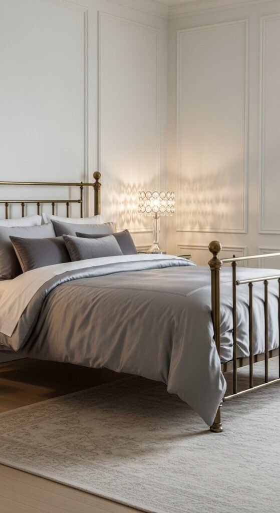
Porcelain and Graphite Balance
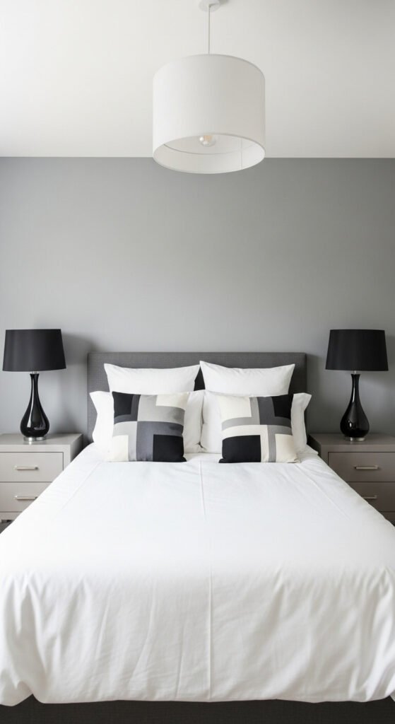
Porcelain white stays bright and clean. Graphite gray adds bold contrast.
Use porcelain white as base and graphite for one dramatic wall. Balance light and dark throughout space.
Budget version: Porcelain white primer works as finish paint. Graphite contact paper creates temporary accent walls. Mixed metals prevent expensive matching sets.
This high-contrast approach defines spaces clearly. Works well in studio apartments or open layouts. The drama stays restful rather than stimulating.
Wheat and Mica Gray Warmth
Wheat brings golden hour warmth. Mica gray has subtle sparkle undertones.
Paint walls wheat and choose mica gray for fabrics. Add natural wood and fiber elements.
Cheap ideas: Wheat fields inspire free seasonal decor. Mica shimmer comes from satin paint finish. Natural fibers cost less than synthetics long-term.
This combination feels like permanent sunshine. Great for basement bedrooms or dark spaces. The warmth compensates for lack of natural light.
Bone White and Pewter Sophistication
Bone white has depth that stark white lacks. Pewter gray adds metallic sophistication.
Use bone white everywhere except one statement piece in pewter. Add reflective elements like mirrors or glass.
Affordability hacks: Bone color comes from mixing white with tiny brown drops. Pewter spray paint transforms thrift finds. Glass elements from dollar stores catch light beautifully.
This palette feels luxurious without actual luxury prices. The subtle shimmer adds perceived value. Perfect for people who want elegant simplicity.
Sandstone and Slate Blue Calm
Sandstone brings desert warmth. Slate blue-gray adds unexpected coolness.
Paint walls sandstone and introduce slate blue through textiles. The temperature mix creates interesting tension.
Budget approach: Sandstone rocks inspire color matching at paint stores. Blue-gray fabric dye creates slate tones. Dried flowers last months without cost.
This combination works in both warm and cool climates. The balance prevents seasonal redecoration. Your room stays comfortable year-round.
Conclusion
These 22 neutral palettes prove boring bedrooms are a choice, not a requirement. You don’t need bright colors to create interest or spend thousands on renovation. Start with paint samples to test colors in your actual lighting. Add one new element at a time—maybe swap pillows first, then curtains, then larger pieces. Shop your home before buying new items. That gray throw in the living room might work perfectly in your bedroom. Mix high and low pieces without guilt. Target pillows look great next to vintage finds. Your bedroom should feel like a personal retreat, not a magazine spread. Pick the palette that speaks to you and make it work with what you have. Better sleep starts with a space that truly relaxes you. Which combination will you try first?