Monochrome interiors have a quiet power that most people underestimate. Strip a room down to one color family and something surprising happens — the space feels larger, calmer, and more intentional. It’s not about being boring. It’s about being deliberate. Whether you’re drawn to crisp all-white rooms, moody all-black studies, or warm caramel-washed living areas, a single-color scheme forces you to get creative with texture, tone, and shape. The result is always striking. These 22 ideas will show you exactly how to pull it off — on any budget.
1. The All-White Kitchen That Feels Like a Cloud
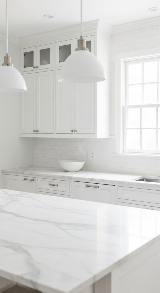
White kitchens never go out of style — and they’re easier to achieve than you think. Paint your cabinets, walls, and ceiling the same white. Use different finishes — matte walls, satin cabinets, gloss tiles — to add depth without adding color. A budget hack: swap out hardware for white ceramic or chrome knobs. Add white linen dish towels and a white ceramic soap dispenser. The layered whites create a soft, dimensional look that feels expensive. Total cost to refresh? Under $150 if you DIY the cabinet painting yourself.
2. Charcoal Grey Bedroom for Deep, Restful Sleep
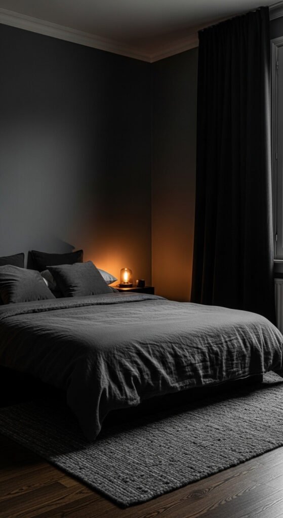
Dark grey bedrooms feel like a weighted blanket in room form. The key is going all-in — don’t stop at the walls. Get charcoal bedding, a dark rug, and dark curtains. Use varying textures like velvet, wool, and linen to keep it from feeling flat. A cheap trick: buy grey duvet covers from discount home stores and layer two different shades. Add a warm-toned lamp to stop the room from feeling cold. This is a scheme that works in small rooms too — dark colors don’t always shrink a space.
3. Sandy Beige Living Room With Warm Layered Textures
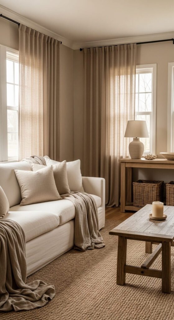
Beige gets a bad reputation — but done right, it’s one of the most soothing palettes you can live in. Choose one anchor tone, like warm sand, and build everything around it. Mix textures: chunky knit throws, woven baskets, linen cushions, raw wood. The variation in materials is what makes the room feel rich. Shop thrift stores for natural-fiber pieces in neutral tones — they’re everywhere. A sand-colored room with a jute rug and cream sofa costs almost nothing to put together if you’re patient and shop secondhand.
4. Inky Navy Blue Bathroom That Feels Like a Spa
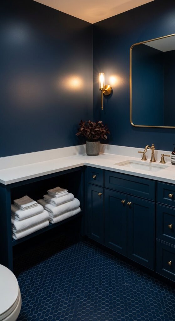
A navy bathroom sounds intense — but it works beautifully in small spaces. Dark colors in bathrooms make the room feel intentional rather than cramped. Paint the walls and vanity the same navy. Keep hardware gold or brass for warmth. Fold crisp white towels as your only contrast. This gives the eye a place to rest without breaking the scheme. You can paint a bathroom in an afternoon for under $40 in paint. Use eggshell finish for moisture resistance. It’s one of the highest-impact, lowest-cost upgrades you can make.
5. Warm Terracotta Living Room That Glows at Night

Terracotta is having a well-deserved moment — and it performs especially well in low light. This color comes alive in the evening, making it perfect for living rooms and dining spaces. Layer rust, burnt sienna, and amber tones together. Unglazed terracotta pots make great, cheap accessories. A secondhand velvet sofa in rust or orange can often be found for under $100 at estate sales. Paint the walls in a limewash-style finish using regular paint and a wet rag technique — it’s free and looks incredible.
6. Crisp Black and Off-White Study That Means Business
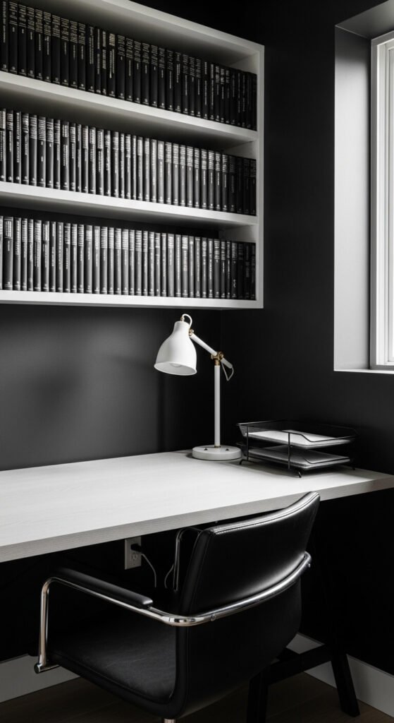
A black study signals focus. It’s a room that says this is where work happens. Matte black walls absorb distraction — literally. Pair with white or natural wood furniture to stop the room from going cave-dark. Keep accessories limited: one lamp, one plant, clean shelving. This scheme works even in a small corner office. You don’t need a full room. Paint just one wall black and arrange your desk against it. Black paint is often the same price as any other color — it just feels more committed.
7. Sage Green Bathroom With a Garden Feel
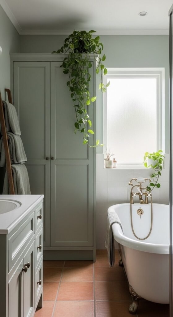
Sage green is the most forgiving monochrome palette you can choose — it works with almost any natural light condition. It makes a bathroom feel like an indoor garden. Paint the walls and vanity the same sage. Add a few real plants in terracotta pots — pothos and ferns thrive in bathroom humidity. Keep towels in the same green family. You can find sage green towel sets at most discount stores for under $20. The plant additions are free if you propagate from a friend’s cutting. Low effort, high reward.
8. Dusty Rose Bedroom That Feels Soft and Grown-Up
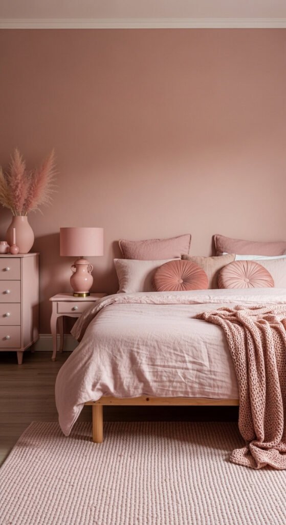
Dusty rose is not a “girly” color — it’s a sophisticated, muted tone that works beautifully in bedrooms for any adult. The trick is to keep it muted. Avoid bright pinks. Stick to dusty, chalky, or earthy rose tones. Layer linen, velvet, and cotton in varying shades. Dried pampas or dried roses make perfect accessories — they’re cheap and long-lasting. A blush paint and matching duvet cover can be sourced for well under $80. This palette photographs beautifully in natural morning light, which is a nice bonus.
9. Stark White Dining Room That Makes Food the Star
When you strip a dining room of color, the food and the people become the centerpiece. White dining rooms feel like clean slates — ready for whatever happens around the table. Keep the table natural wood or paint it white. Use white linen chairs or slipcover your existing chairs in white cotton canvas. A cheap DIY: make chair slipcovers from IKEA drop cloths — they’re pre-hemmed, machine-washable, and cost almost nothing. Hang a simple white pendant light. The room will photograph beautifully every time you host.
10. Deep Forest Green Living Room That Feels Grounded
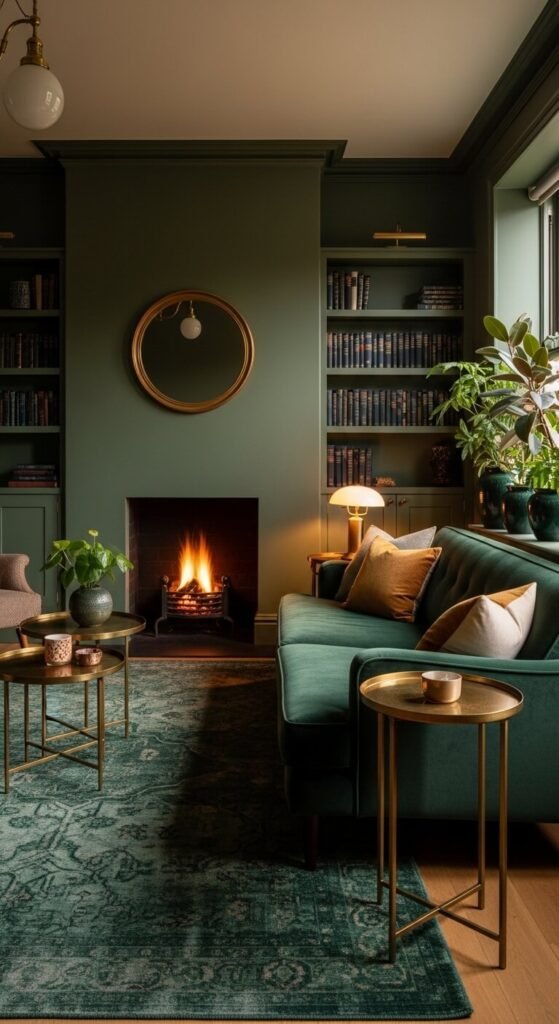
Forest green rooms feel like the indoors and outdoors are having a conversation. This is a color for people who want a room that feels rooted. Go dark and commit. Paint walls, trim, and built-ins the same shade. Use brass or dark bronze hardware for warmth. Add a leather armchair in cognac brown — it sits outside the scheme but complements it perfectly. Deep green paint is widely available and often on sale at paint stores. Layer in real plants for obvious reasons — they disappear beautifully into green walls.
11. Mushroom Brown Bedroom That Feels Like a Retreat
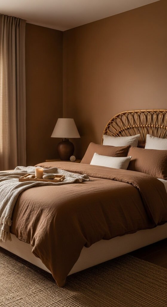
Mushroom brown is the color of calm weekends. It’s warm without being orange, dark without being heavy. This palette is built on restraint — the beauty is in what you leave out. Use natural materials: rattan, linen, unglazed ceramics. Avoid anything shiny or synthetic. Source a brown linen duvet from a discount linen store — they’re usually affordable and easy to find. Paint your walls in a warm greige-brown and add a jute rug for texture. The whole scheme can come together for under $200 if you shop patiently.
12. Pale Blue Kitchen With a Calm, Nordic Feel
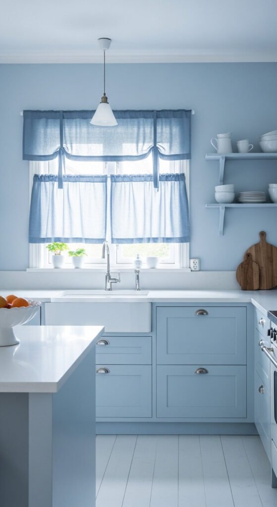
Pale blue kitchens have a timeless, Nordic quality that feels calm without being cold. The secret is keeping the blue very light — almost a whisper. If it’s too saturated, it’ll feel like a pool. Paint cabinets and walls the same pale blue. Use white or pale stone countertops. Add simple white ceramics as accessories. This is one of the easiest kitchen refreshes you can do yourself — a gallon of paint and a weekend is all it takes. Sand and prime the cabinets well first and the finish will last for years.
13. Bright White Bathroom With Glossy Metro Tiles
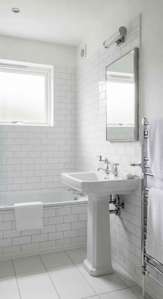
All-white bathrooms are the closest thing to a blank canvas you’ll find in a home. Glossy tiles reflect light and make even tiny bathrooms feel open. Stick to one tile shape throughout — metro tiles on the walls and large white squares on the floor read as cohesive rather than busy. Add white accessories: soap dish, toothbrush holder, towels. Re-grout old white tiles in bright white grout for an instant refresh — a grout pen costs under $10. This is one of the best bang-for-buck bathroom updates available.
14. Warm Ivory Living Room With Layered Natural Materials
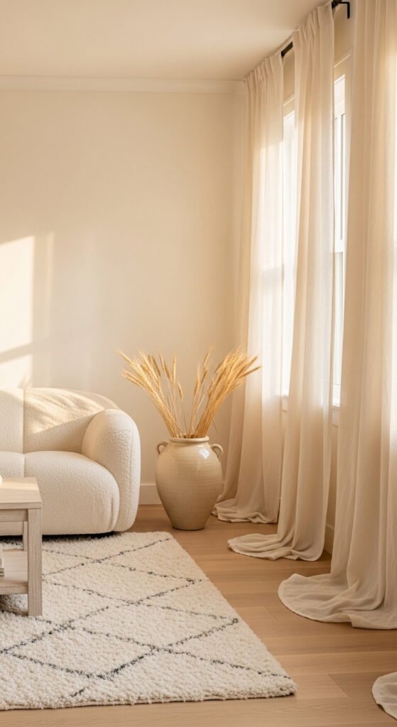
Ivory is warmer than white and more interesting than beige. It’s the perfect in-between tone for people who want warmth without color. The key to making ivory work is layering as many natural textures as possible. Think bouclé, shearling, linen, cotton knit, raw wood, dried grasses. All of these look rich against ivory walls. Shop for cream and natural-fiber pieces at IKEA or secondhand markets. The materials cost far less than you’d expect. A bouclé-look throw from a discount store can cost as little as $15.
15. Bold Black Bathroom That Feels Like a Design Statement
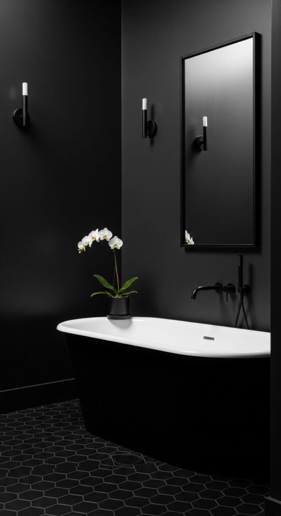
An all-black bathroom is not for the faint-hearted — but it is for anyone who wants a room that stops people in their tracks. Commit completely. Paint walls, ceiling, and vanity the same matte black. Use black grout on any tiles. Replace hardware with matte black fixtures — these are widely available and surprisingly affordable online. Add a single white element: white towels, a white orchid, white soap. That one contrast makes the black even blacker. It’s a small bathroom trick that punches well above its cost.
16. Warm Ochre Dining Room That Feels Like Southern Europe
Ochre dining rooms feel like every meal is a long, unhurried Italian supper. This color comes alive under warm artificial light — making it a natural choice for a room used mostly in the evenings. Use a limewash paint technique for texture — it adds depth and looks artisanal. Keep furniture dark wood and accessories terracotta or amber glass. Ochre paint in a flat or limewash finish is widely available. The textured wall effect can be achieved with a sea sponge and a slightly diluted second coat — totally free once you’ve bought the paint.
17. Soft Grey Children’s Room That Grows With Them
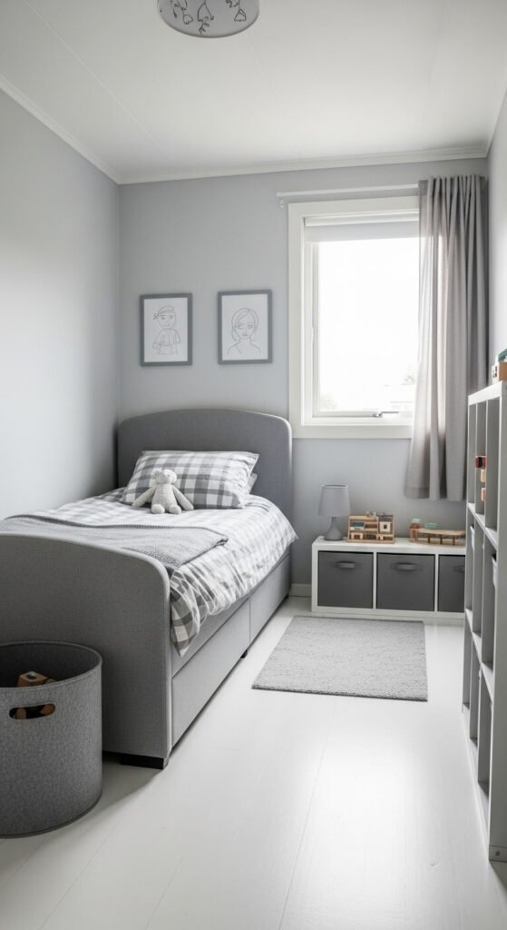
A grey children’s room is one of the smartest design investments a parent can make. Grey is completely age-neutral — it works for a toddler and a teenager without ever needing a repaint. Use soft, warm greys rather than cool ones. Add white accents for lightness. As your child grows, swap only the accessories — bedding, art, storage. The walls stay the same. Grey paint is one of the most widely available, affordable paint colors in any hardware store. Keep decor minimal from the start and the room will always feel put-together.
18. Washed White Bedroom With a Coastal Calm Feeling
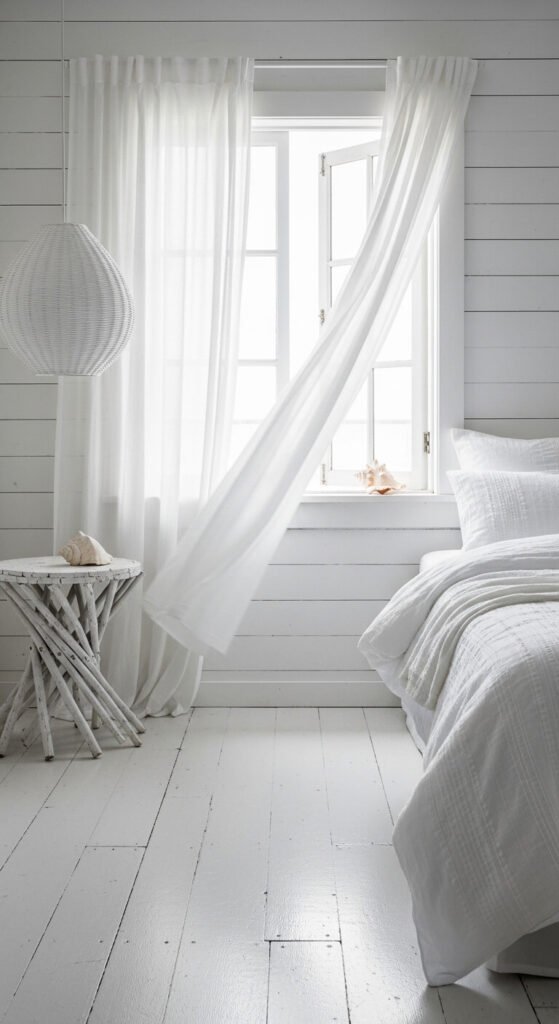
Whitewashed walls have a beautiful, unpretentious quality that feels genuinely relaxed. The washed effect adds texture without pattern — making the room feel dimensional and handmade. You can DIY a whitewash finish using diluted white paint (one part paint, two parts water) applied with a wide brush over wood or plaster walls. Wipe back with a cloth for variation. Use all-white linen bedding — IKEA’s white duvet sets are consistently good value. Add a woven pendant light for softness. The whole thing reads expensive and effortless.
19. Slate Blue Home Office That Encourages Clear Thinking
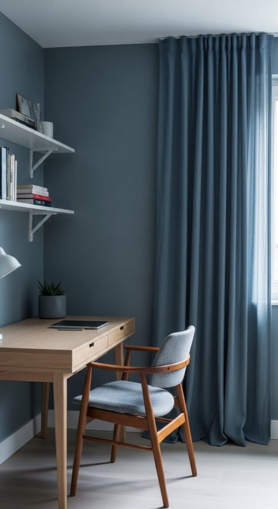
Slate blue is a thinking person’s color. It’s cool without being clinical, calm without being boring. It’s one of the best colors for a home office because it reduces visual noise. Paint walls and curtains in the same muted slate blue. Use pale or white furniture so the room doesn’t get too dark. This palette is especially good in north-facing rooms that get cool, even light all day. A cheap version: buy slate blue paint from a discount paint store and use a white IKEA desk. The combination works immediately.
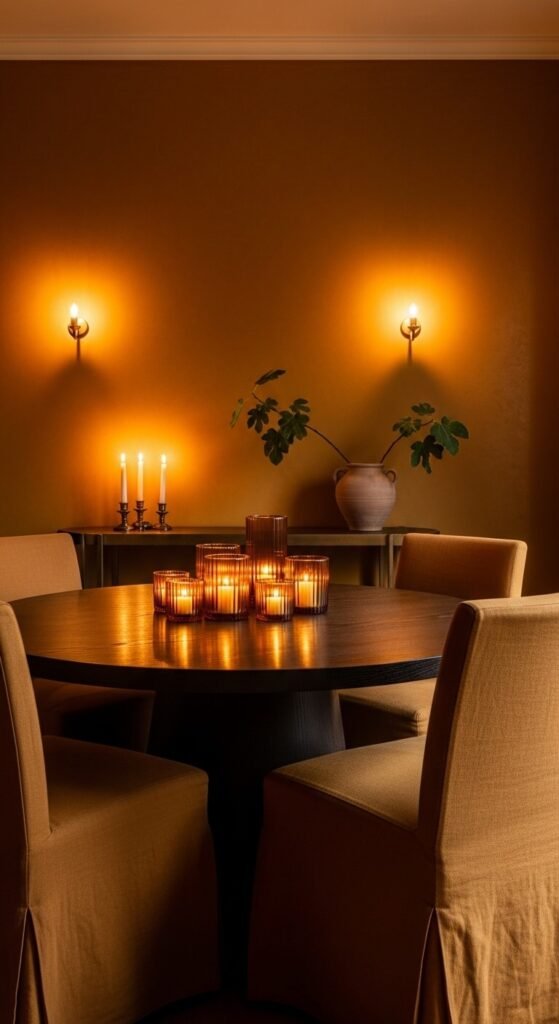
20. Rich Burgundy Dining Room That Commands Attention
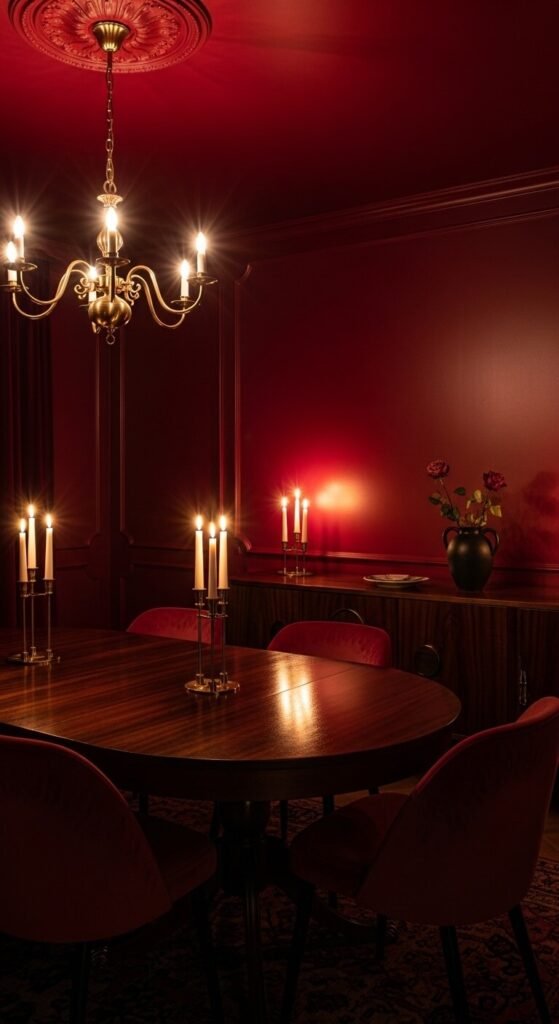
Burgundy dining rooms are designed for intimacy. When you paint the ceiling the same color as the walls, the room wraps around you like a tent — in the best possible way. This technique, called “color drenching,” is one of the most powerful tricks in monochrome design. Use candles and warm-toned bulbs — this color loves warm light. You can find second-hand velvet dining chairs in wine tones on Facebook Marketplace and eBay regularly. Reupholster seat pads yourself with fabric from a remnant bin. Total cost: often under $50 per chair.
21. Pale Lemon Yellow Kitchen That Feels Cheerful and Light
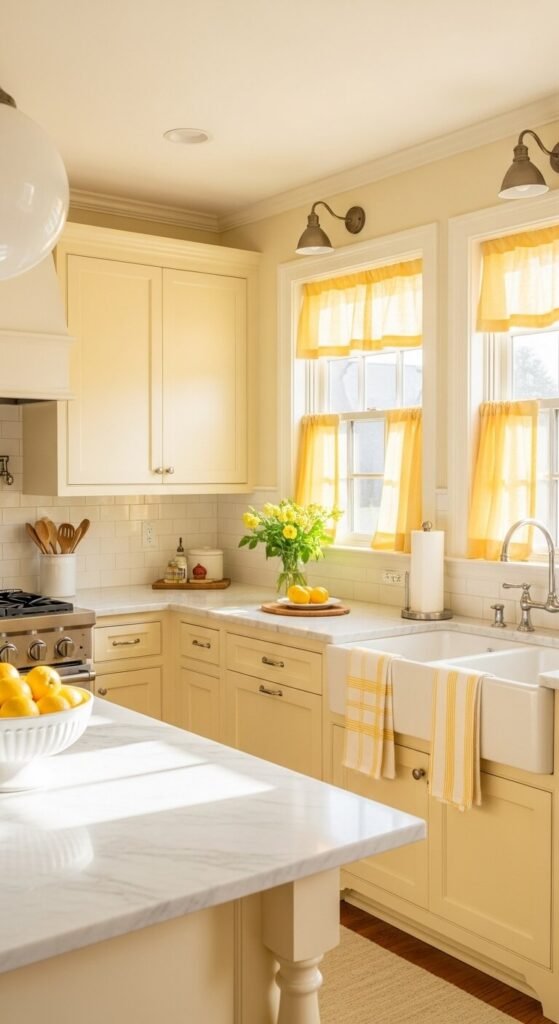
Pale yellow kitchens are one of the happiest rooms you can wake up to. Keep the yellow very soft — more cream than lemon — and it reads as warm and timeless rather than jarring. Paint the walls and cabinets in the same muted yellow. Use white counters and white accessories to keep things light. This scheme photographs exceptionally well in morning light, which makes it a joy to cook in early in the day. A single bowl of real lemons is the only accessory you’ll ever need on that counter.
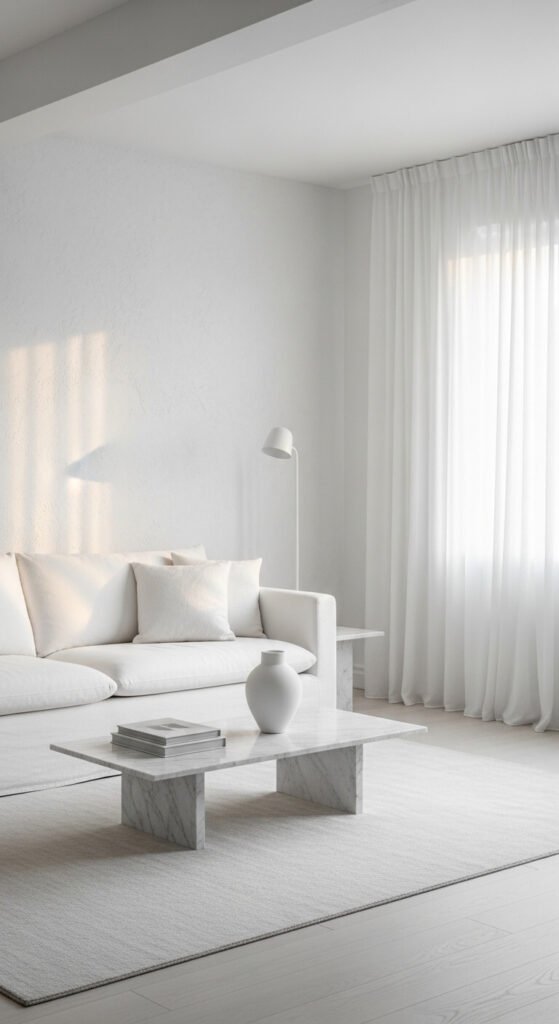
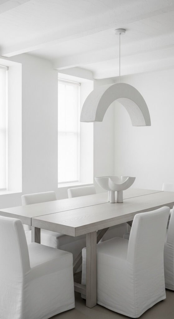
22. Cool White and Light Stone Living Room With Sculptural Detail
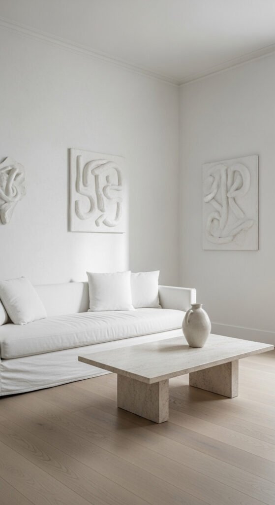
The white-and-stone palette is architecture at its purest. It works best when the materials have natural variation — plaster walls, textured linen, raw limestone, rough ceramics. Let the material do the work so you don’t need color. This is a scheme that rewards patience: find each piece slowly, from thrift stores, secondhand markets, and stone suppliers’ offcut bins. A chunk of raw limestone or travertine from a tile offcut bin can cost almost nothing and makes a genuinely beautiful coffee table object. This is slow decorating at its most satisfying.
Conclusion
Monochrome design asks one thing of you: commitment. The rooms that work best are the ones where the designer chose a direction and followed it all the way through — to the ceiling, to the trim, to the accessories. That’s actually good news for a tight budget. When you’re working with one color, every pound or dollar you spend lands harder. A single great lamp, one beautiful throw, one well-chosen rug — they all matter more because there’s nothing else competing for attention. Pick the palette that resonates with how you want to feel in your home. Then go all in.