Floating shelves turn blank walls into functional art galleries. They showcase your personality while keeping clutter at bay. The right styling approach makes rooms feel curated without looking staged. Small tweaks in arrangement, spacing, and object selection create dramatic differences. Whether you’re working with rustic wood planks or modern metal brackets, these tricks help you master the visual game. Transform those empty surfaces into conversation starters that reflect your unique style.
Start With a Single Statement Piece
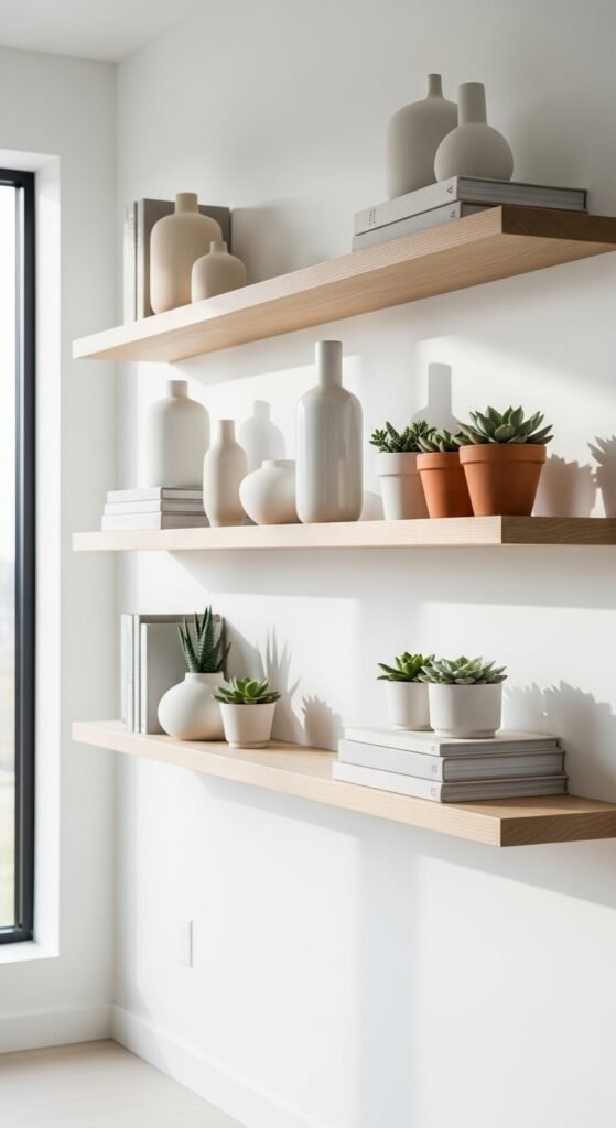
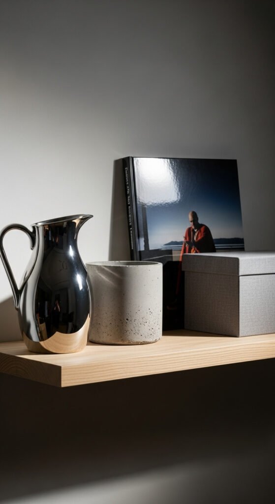
Choose one object that demands attention and build around it. A vintage clock, sculptural vase, or framed print works perfectly. Place this anchor piece slightly off-center rather than dead middle. Your eye naturally travels to bold items first.
Add two or three smaller supporting pieces nearby. Keep at least 30% of the shelf empty. White space prevents visual chaos.
Budget hack: Thrift stores stock unique ceramics and artwork for under $10. Spray paint outdated frames in matte black for instant refresh.
Use the Rule of Three for Balance
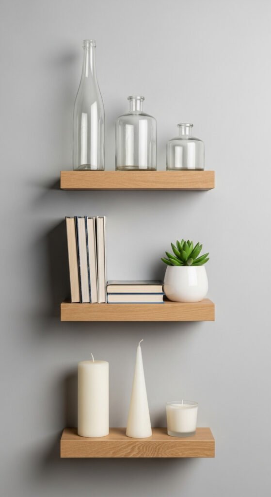
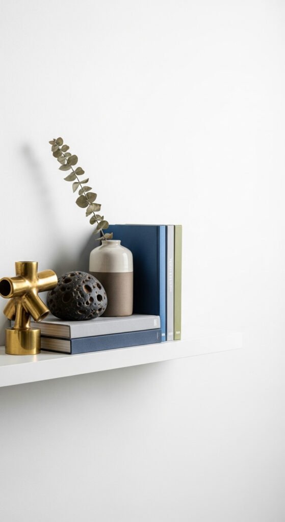
Group items in sets of three for pleasing symmetry. Mix heights—tall, medium, short. Odd numbers feel more organic than even pairs.
Try three small succulents in different pots. Or stack three books with a candle on top. Vary textures like smooth glass, rough ceramic, soft fabric.
Space your trios across the shelf length. Leave breathing room between groups. This rhythm guides the eye smoothly from left to right.
Dollar store finds work great for practice runs before investing in pricier pieces.
Layer Objects Front to Back
Create depth by placing items at different distances from the wall. Lean artwork or mirrors in back. Position plants or vases mid-shelf. Tuck tiny treasures up front.
This layering technique adds dimension to flat surfaces. Your shelf becomes a mini stage rather than a lineup.
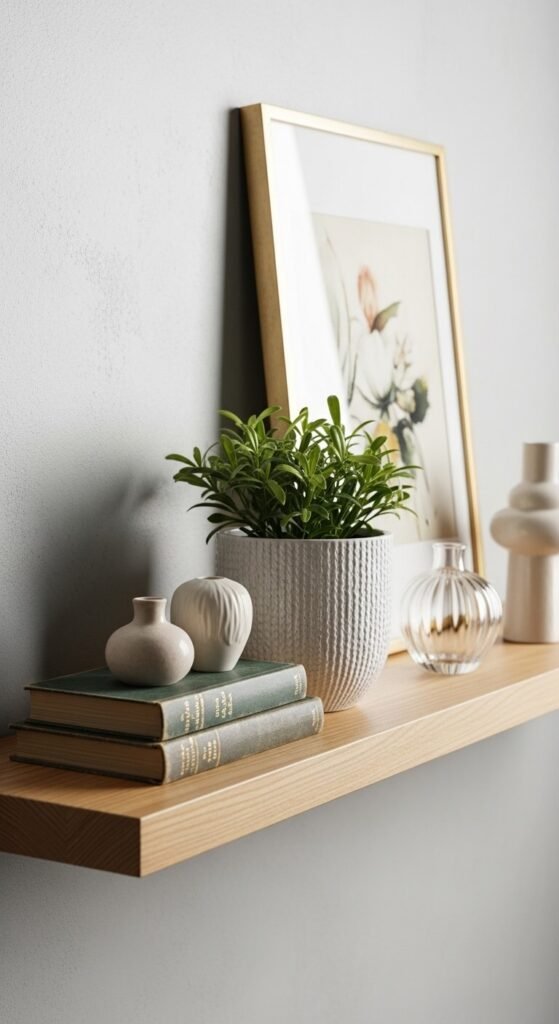
Use books as risers for small objects. A stack of two hardcovers lifts decorative boxes or candles to perfect viewing height.
Save shoeboxes wrapped in fabric scraps as hidden platforms behind displayed items.
Mix Vertical and Horizontal Lines
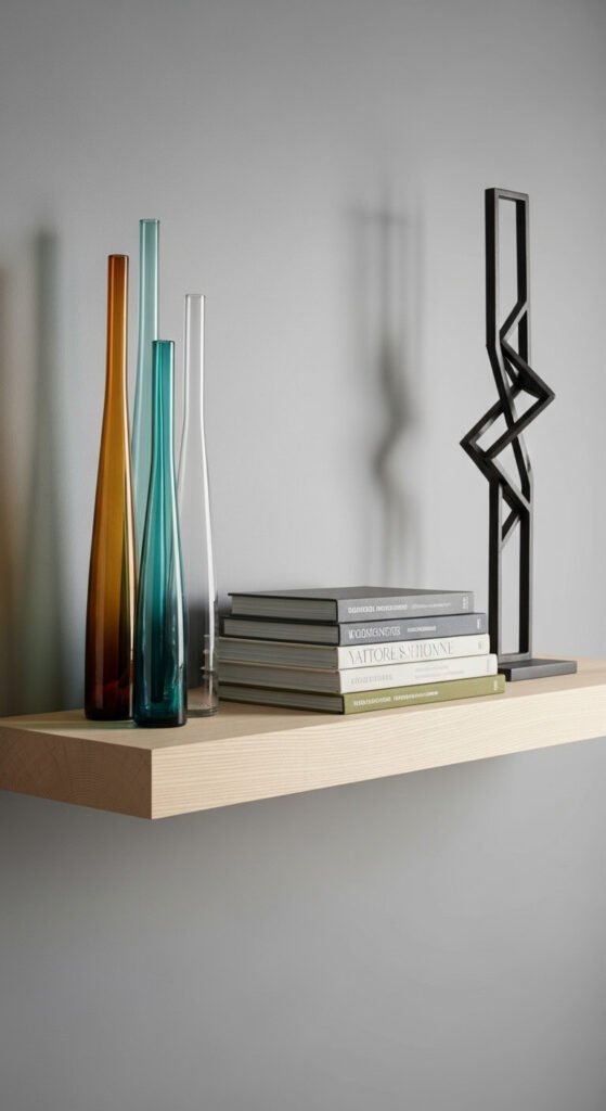
Combine upright objects with horizontal stacks. Stand bottles or candlesticks next to lying books. The contrast creates energy.
Vertical pieces draw eyes upward, making ceilings feel higher. Horizontal arrangements ground the display and provide rest stops for scanning eyes.
Try a tall plant beside a horizontal row of small frames. Or lean a vertical mirror next to stacked vintage suitcases.
Repurpose wine bottles as vases for free vertical elements. Remove labels with hot water and soap.
Embrace Asymmetry for Modern Flair
Skip perfect symmetry for contemporary appeal. Cluster objects on one side, leave the other sparse. This feels curated, not accidental.
Place your heaviest visual weight slightly off-center. Balance with negative space rather than matching objects on opposite ends.
Think of your shelf as having weighted zones. A busy left side can balance with a single striking piece on the right.
Test arrangements by photographing them. Camera reveals what your eyes might miss about visual weight distribution.
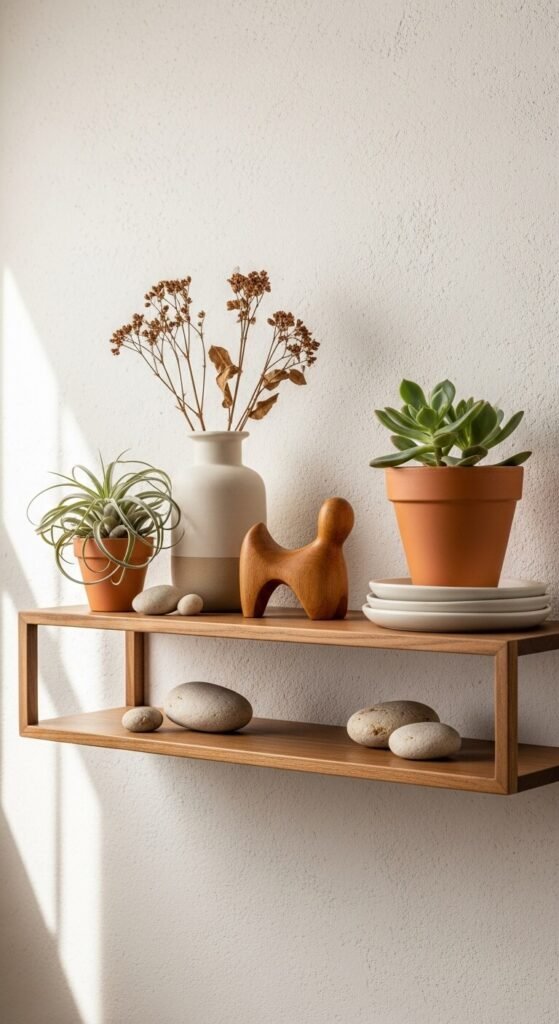
Add Greenery at Multiple Heights
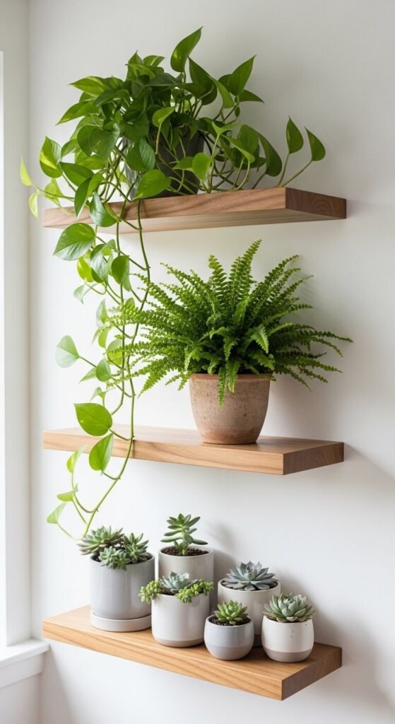
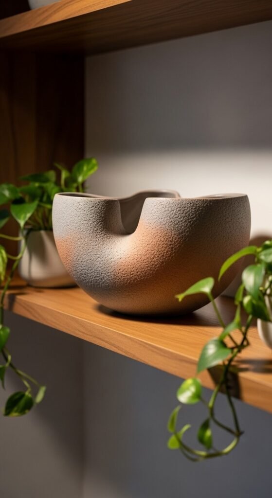
Plants bring life and soften hard edges. Mix trailing vines, upright specimens, and compact succulents. Vary pot heights and styles.
Let pothos or string of pearls drape over shelf edges. This vertical movement adds softness. Pair with structured plants like snake plants for contrast.
Group three small succulents in mismatched pots for texture variety. Water-propagated cuttings cost nothing and root in weeks.
Dollar store artificial plants work if your space lacks natural light. Mix with one real plant for authenticity.
Stick to a Cohesive Color Story
Pick three main colors and stick to them. Earth tones, pastels, or monochrome schemes all work. Repetition creates flow across multiple shelves.
Pull colors from existing room elements. Match throw pillow hues or artwork tones. This ties shelves into your overall design.
Spray paint thrifted items to fit your palette. Matte finishes in blush, sage, or charcoal update mismatched pieces instantly.
Budget white dishes and clear glass work with any scheme. Start there and add pops of color gradually.
Display Books Cover-Out for Color Blocks
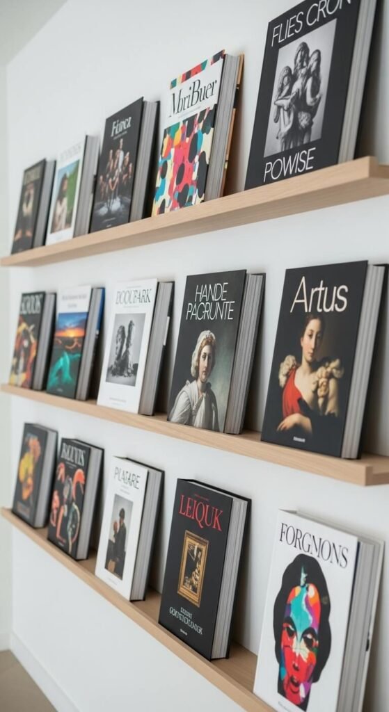
Turn select books to show covers instead of spines. Choose volumes with beautiful photography or bold graphics. This creates colorful focal points.
Stack these face-out books horizontally for extra impact. Mix with traditional spine-out arrangements to avoid monotony.
Library book sales offer gorgeous coffee table books for $1-3. Hardcovers add instant sophistication. Color-coordinate spines if keeping them spine-out.
Wrap damaged covers in kraft paper and hand-letter titles for cohesive neutral look.
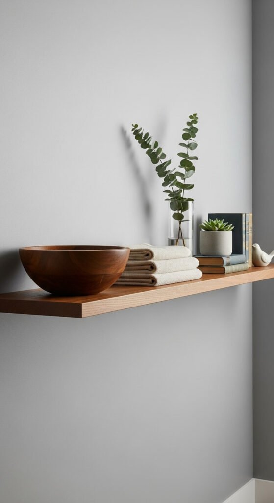
Incorporate Functional Items as Decor
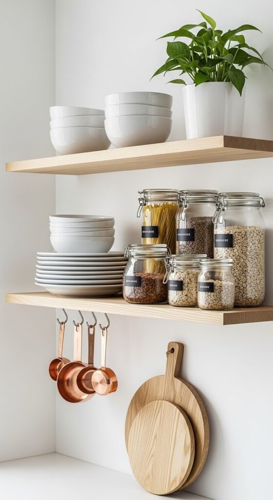
Style with things you actually use. Pretty mugs, stacked plates, or glass storage jars look good while staying accessible.
In kitchens, display wooden utensils in ceramic crocks. Arrange spice jars by height or color. Functionality meets aesthetics beautifully.
Bathrooms benefit from rolled towels, apothecary jars with cotton balls, and small plant arrangements. These serve dual purposes daily.
Mason jars cost pennies at yard sales. Use them for everything from kitchen staples to bathroom supplies.
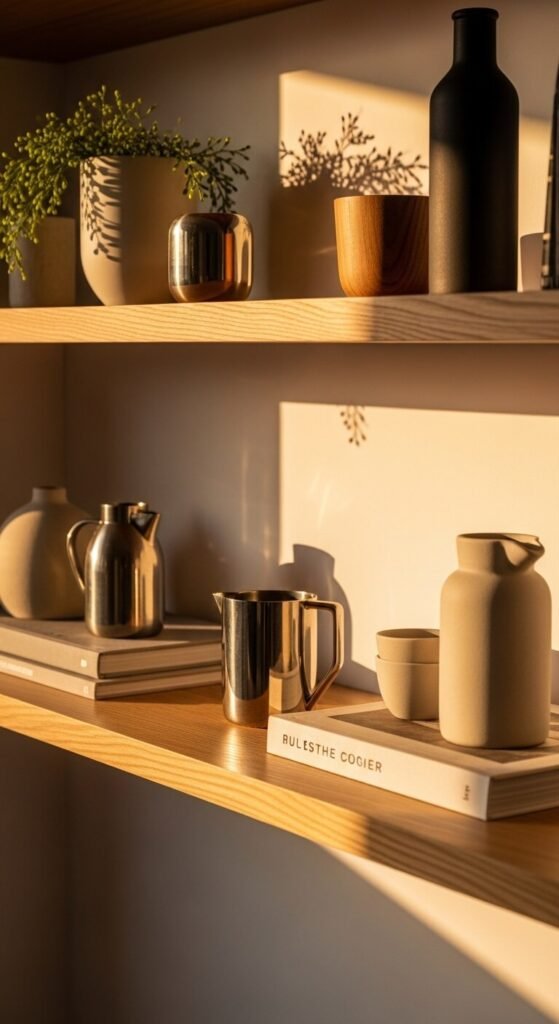
Vary Texture for Tactile Interest

Combine smooth ceramics with rough baskets. Pair shiny metal with matte wood. Soft textiles contrast hard glass. This variety engages viewers beyond color alone.
Touch matters even in visual design. Eyes recognize texture differences and find them satisfying. Run through these categories: glossy, matte, rough, smooth, woven, polished.
Thrift stores overflow with textured finds. Woven baskets, brass candlesticks, and pottery pieces add dimension cheaply.
Natural elements like driftwood, stones, or pinecones bring free texture from outdoor walks.
Light Objects From Below or Behind
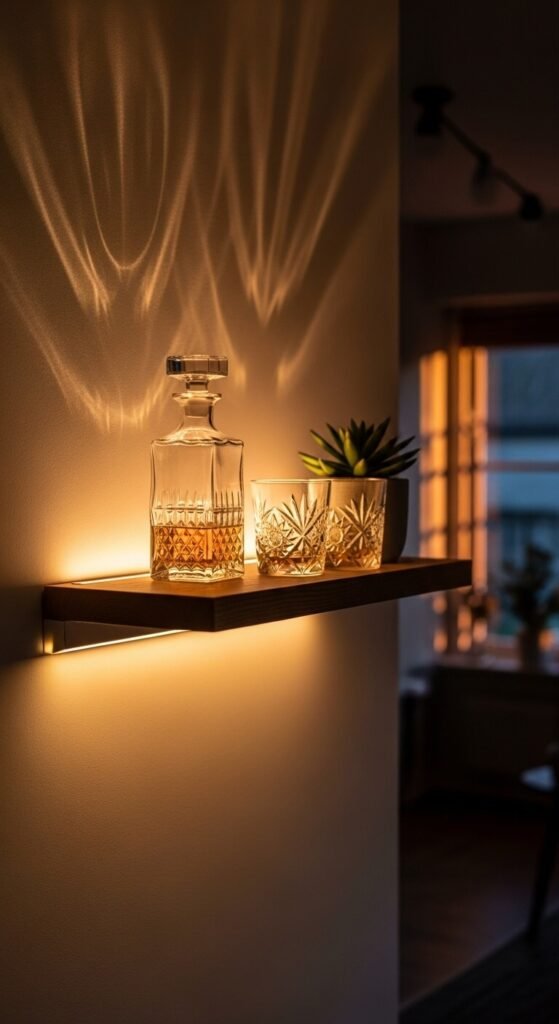
Add battery-powered LED strips under shelves for drama. Uplighting creates shadows that highlight dimensional objects. Glass items sparkle beautifully when backlit.
Puck lights stick behind transparent vases or art pieces. This halo effect draws attention after dark. Motion sensors make them automatic.
Dollar store LED tap lights work perfectly. Stick them under shelves with command strips. No wiring required.
Natural window light changes throughout the day. Notice how morning versus evening sun affects your arrangement differently.
Create Rhythm With Repeating Shapes
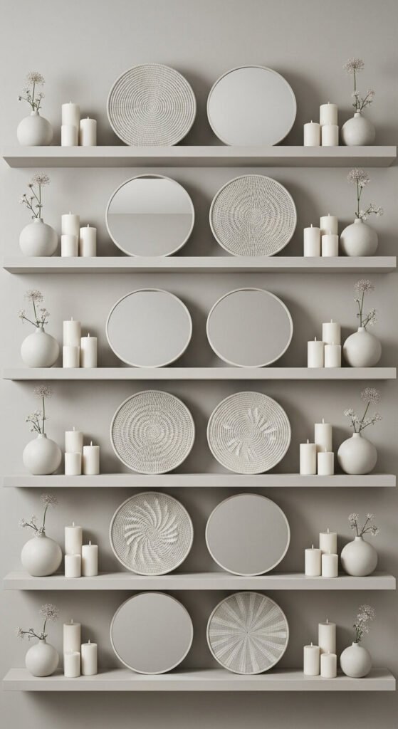
Repeat one shape across your display. All round objects, rectangular frames, or triangular elements create visual rhythm. Vary sizes to prevent monotony.
Try three round mirrors at different sizes. Or group square frames with square boxes and cube planters. The pattern pleases without being obvious.
Shape repetition works subtly. Your conscious mind might not notice, but the effect feels organized and intentional.
Cut cardboard circles in various sizes and wrap in fabric scraps for free decorative rounds.
Lean Artwork Instead of Hanging

Props frames against the wall for casual elegance. This approach feels relaxed and allows easy rotation. Swap artwork on a whim without new nail holes.
Layer smaller frames in front of larger ones. Mix frame colors and materials for collected-over-time appeal. Lean some directly on shelf, others on book stacks.
Build shallow lips on DIY shelves with quarter-round molding. This prevents artwork from sliding off while maintaining the leaning look.
Frame grocery store botanical prints or calendar pages for nearly-free artwork rotation.
Use Height Variation Strategically

Arrange items from tall to short, or create a peak in the middle. Intentional height progression guides eye movement smoothly.
Avoid same-height items lined up like soldiers. Boring. Instead, think mountains and valleys. Let the eye travel up and down naturally.
Stack books to boost shorter objects. Candlesticks elevate tiny treasures. Inverted bowls hide under decorative boxes for secret height.
Measure items before buying. Knowing your shelf depth prevents purchasing things that stick out awkwardly or disappear in back.
Ground Large Shelves With Heavier Items
Place visually heavy objects lower or toward ends. Large bowls, thick books, or chunky pottery anchor arrangements. This prevents top-heavy feelings.
Heavy items include dark colors, dense materials, and bulky shapes. Position these as foundation pieces. Build lighter objects around them.
Your eye reads weight even in stationary objects. Dark colors feel heavier than light ones. Solid items outweigh delicate pieces.
Filled baskets provide affordable visual weight. They’re also functional for hiding clutter like remotes or mail.
Introduce Metallic Accents Sparingly
Add one or two metal pieces for subtle shine. Brass, copper, or silver catch light and add sophistication. Too much reads gaudy.
Mix metal finishes for collected look. One gold frame, one silver vase, one copper bowl works together. Matchy-matchy feels forced.
Spray paint thrifted items metallic. Vases, picture frames, and candlesticks transform with $5 paint. Matte metallics feel more expensive than shiny.
Polish existing metals with ketchup or lemon juice. Free shine makes secondhand brass glow like new.
Balance Negative Space With Filled Areas

Empty space matters as much as filled areas. Give objects room to breathe. Shelves crammed full create visual stress.
Aim for 40% empty shelf surface. This percentage feels curated, not sparse. Objects get individual attention rather than competing for notice.
Group items in clusters with gaps between. Think island groupings separated by water, not continental landmasses touching everywhere.
Take photos to check balance. Camera reveals overcrowding your eyes might normalize from daily exposure.
Rotate Seasonal Elements Regularly
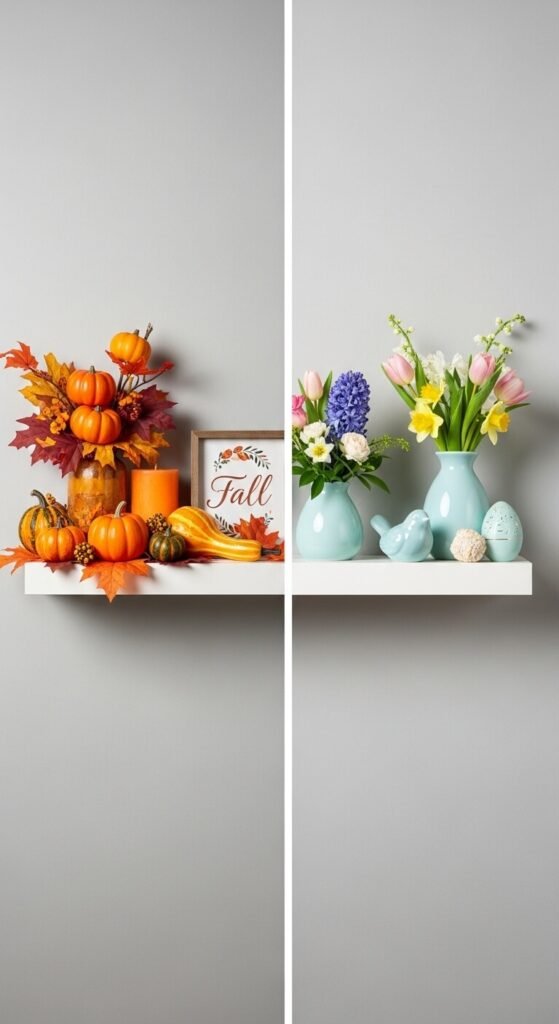
Swap a few items quarterly to keep displays fresh. Add pinecones in fall, fresh blooms in spring, shells in summer, evergreen sprigs in winter.
Keep core pieces year-round. Change 20-30% of objects seasonally. This maintains familiarity while preventing staleness.
Nature provides free seasonal decor. Collect branches, leaves, stones, or flowers from walks. Display in simple glass bottles.
Dollar store seasonal sections offer inexpensive swaps. Small decorative pumpkins, faux flowers, or holiday ornaments refresh shelves cheaply.
Style in Triangular Formations
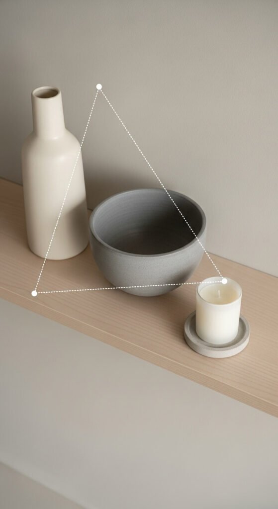
Arrange three items in triangle shapes. One tall back-left, one medium front-center, one short back-right. This creates movement and feels professionally styled.
Triangles work at any scale. Three shelves forming a triangle on the wall. Three objects on one shelf. Even three colors distributed triangularly.
Your eye naturally travels triangle paths. This shape feels complete and balanced without being static or boring.
Practice with painter’s tape on your wall. Mark triangle points before installing multiple shelves for perfect spacing.
Mix Matte and Glossy Finishes
Combine shiny glazed ceramics with matte pottery. Glossy books next to matte fabric. This finish contrast adds sophistication without color changes.
Glossy surfaces reflect light and feel energetic. Matte finishes absorb light and seem calm. The push-pull between them creates depth.
Spray paint changes finish instantly. Turn glossy thrift finds matte, or vice versa. Chalk paint creates ultra-matte texture on anything.
Natural wood brings matte warmth. Glass and metal add gloss. Mix these materials for automatic finish variety.
Add Personal Meaningful Objects
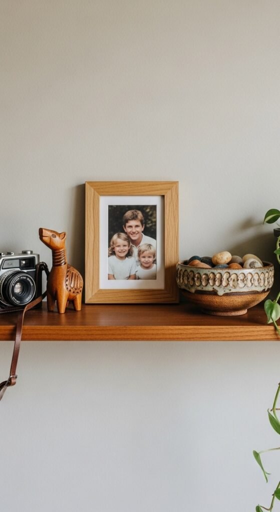
Include items with stories. Travel souvenirs, inherited pieces, or handmade pottery make shelves feel authentic. These conversation starters reveal personality.
Balance sentimental items with purely decorative ones. Not everything needs deep meaning, but a few personal touches prevent showroom sterility.
Frame children’s artwork or display their clay creations. Rotate these regularly as new pieces arrive. Your gallery celebrates creativity.
Sentimental doesn’t mean precious. Display affordable treasures like concert tickets in small frames or pressed flowers under glass.
Use Shelf Risers for Dimension

Create tiers with small boxes or platforms. Elevate back items for visibility. This prevents tall objects from hiding short ones behind them.
Inverted bowls work as risers under decorative boxes. Books stack to any height needed. Small wooden blocks disappear behind displayed items.
Kitchen shelves benefit from tiered plate racks. Bathroom shelves use small acrylic risers for skincare products. Function meets form beautifully.
Build simple risers from scrap wood pieces. Sand edges and stain to match shelves. Custom sizing costs almost nothing.
Maintain Consistent Spacing Between Shelves
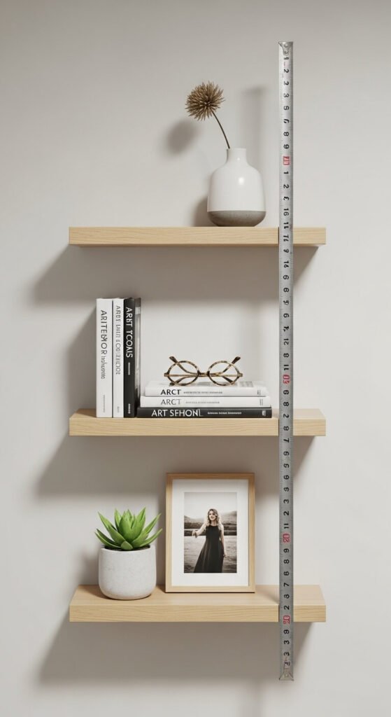
Install multiple shelves at equal vertical distances. Consistent spacing feels intentional and organized. Random heights read chaotic.
Measure carefully before drilling. Mark wall with painter’s tape to preview spacing. Stand back and check from across the room.
Standard spacing ranges from 12-18 inches between shelves. Taller items need more space. Consider what you’ll display before committing to measurements.
Use laser levels for perfect alignment. Borrow one from friends or rent from hardware stores for under $10 daily.
Edit Ruthlessly and Rotate Often

Remove half of what you initially place. Crowded shelves stress the eye. Less really does communicate more.
Box extras and rotate monthly. Fresh eyes catch what daily exposure misses. Swapping items keeps displays interesting without buying new things.
Ask: Does each object earn its spot? Remove anything that doesn’t serve the overall look or function. Be brutal.
Photograph your shelves weekly. Track what works and what doesn’t. Visual records reveal styling patterns you might not otherwise notice.
Incorporate Unexpected Elements
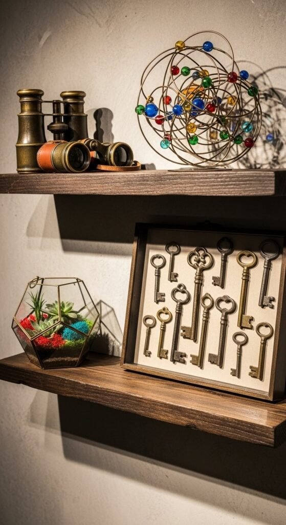
Break rules with quirky finds. Vintage tools, scientific specimens, or colorful toys add character. Unexpected items make shelves memorable.
Flea markets stock weird wonderful things cheaply. Old cameras, compasses, or antique bottles become instant conversation pieces. Mix these with traditional decor.
Children’s collections deserve display space. Rocks, shells, or toy cars arranged thoughtfully look intentional rather than messy.
Your shelves should reflect actual interests. Books you’ve read, hobbies you practice, places you’ve visited. Authenticity trumps Pinterest perfection every time.
Conclusion
Floating shelves transform when you apply these styling principles. Start with one or two tricks and build confidence. Mix personal treasures with budget-friendly finds. Remember that empty space matters as much as filled areas.
Edit ruthlessly and rotate often to keep things fresh. Your shelves should tell your story, not replicate magazine spreads. Take photos to track what works and adjust based on your daily experience with the space. Small intentional changes create rooms that feel collected, curated, and completely yours.