Gallery walls transform blank spaces into personal storytelling canvases. Whether you’re working with family photos, vintage finds, or modern prints, the right layout makes all your memories shine. This guide walks you through 28 proven arrangements that work in any room, on any budget. You’ll discover how to mix frame sizes, choose the perfect spacing, and create professional-looking displays without hiring a designer. From classic grids to asymmetrical clusters, these plans help you showcase what matters most while adding character to your home.
The Classic Grid Layout
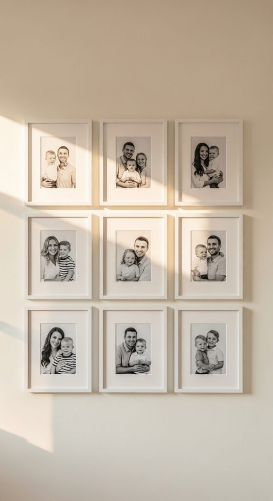
The grid layout brings order to any collection. Start with frames of the same size and color. Measure carefully and keep spacing uniform—two inches works well for most walls. This arrangement suits family portraits, travel photos, or themed collections. Use painter’s tape to mark your layout before hammering nails. The symmetry creates a calming effect that works in bedrooms, hallways, and living rooms. Best part? You can find affordable matching frames at thrift stores or discount retailers for under $5 each.
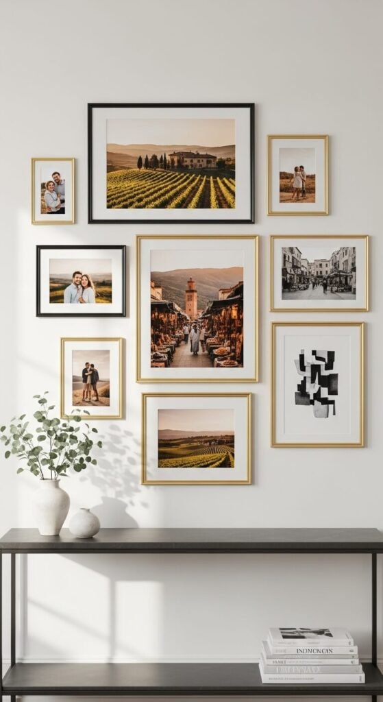
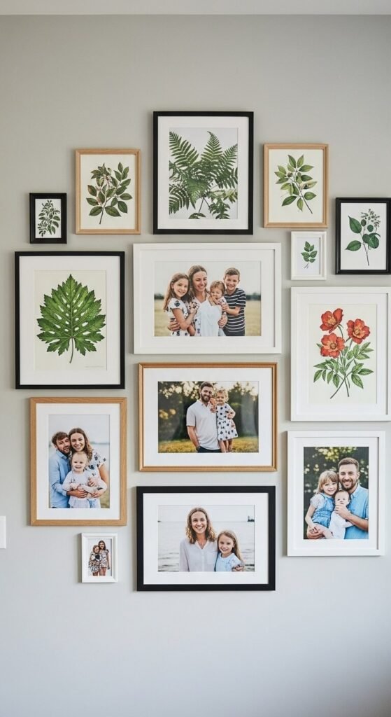
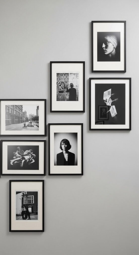
Salon-Style Gallery Wall
Pack your wall with personality using salon-style hanging. Mix different frame sizes, colors, and styles without worrying about perfect alignment. Start with your largest piece at eye level, then build outward. Keep spacing tight—about one inch between frames. This works beautifully with thrift store finds and family heirlooms. The seemingly random arrangement actually requires planning: lay everything on the floor first, snap a photo, then recreate it on your wall. This style hides imperfections and grows with your collection.
Horizontal Linear Display
Single-row displays work wonders in narrow spaces. Line up three to seven frames horizontally at the same height. This layout shines in hallways, above sofas, or along staircases. Keep frames identical in size and style for maximum impact. The linear arrangement guides the eye smoothly across your wall. It’s beginner-friendly—just measure the center point of your wall, mark it with pencil, and work outward from there. Use picture-hanging strips for damage-free installation on rental walls.
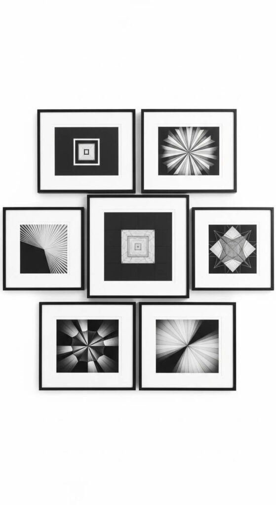
Symmetrical Anchor Layout
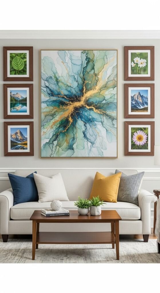
Build your gallery around one statement piece. Choose a large frame or canvas as your centerpiece, then surround it with smaller matching frames. This creates balance while highlighting your favorite artwork. The anchor piece should be roughly twice the size of surrounding frames. Position it first at eye level (57-60 inches from the floor), then add smaller pieces symmetrically on both sides. This layout suits formal spaces and works well above furniture where you want visual weight.
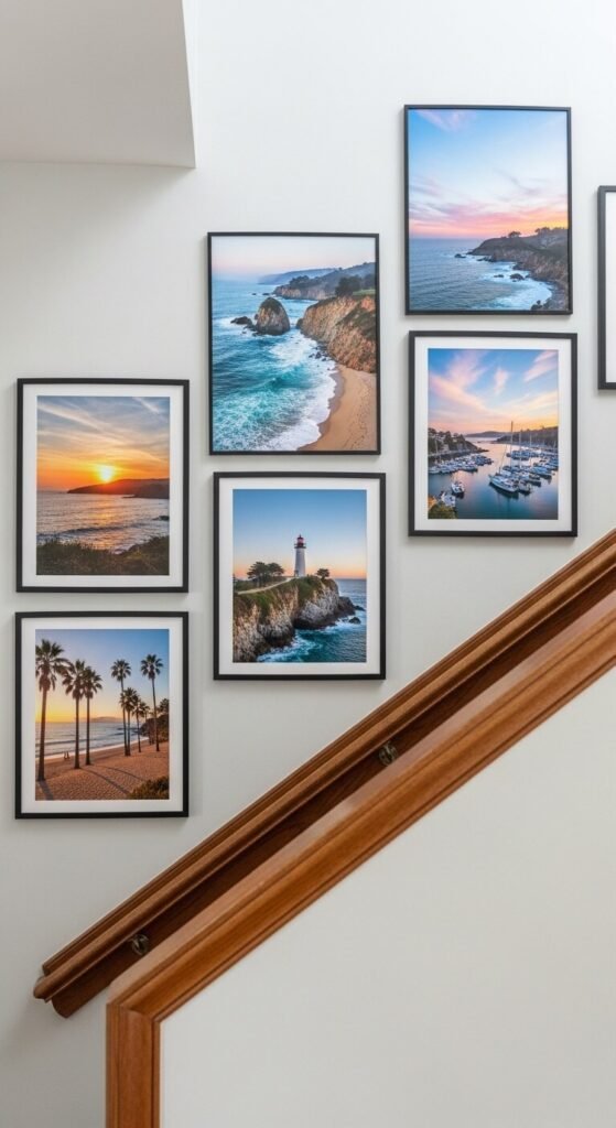
Ascending Stairway Arrangement
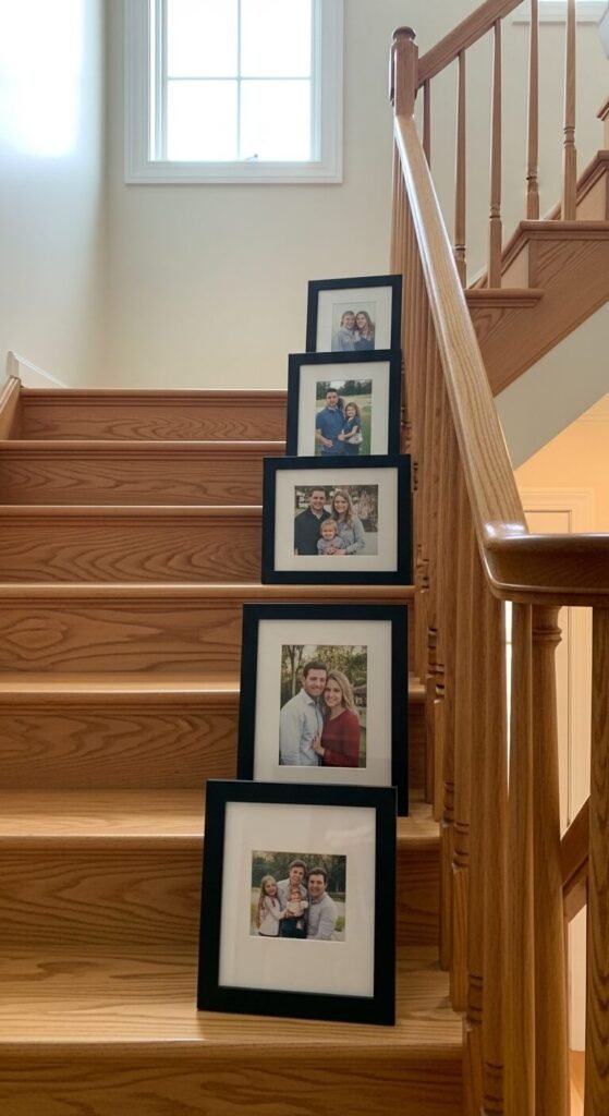
Follow your staircase angle for dynamic flow. Arrange frames so they step up with your stairs, maintaining consistent spacing from the stair rail. This makes climbing stairs more interesting while using otherwise awkward wall space. Mix frame sizes but keep styles cohesive. Measure the distance from each step to the nearest frame—keeping this consistent ensures professional results. Start at the bottom and work your way up. Command strips work well here since constant adjusting is common until you get it right.
Geometric Triangle Formation
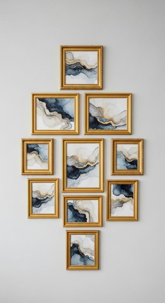
Create visual interest with triangular arrangements. Start with one frame at the top, add two below it, then three, forming a triangle shape. This works inverted too—wide at top, narrow at bottom. The geometric shape draws attention and works well in dining rooms or offices. Use frames in the same color family but varying sizes. The asymmetry feels modern and approachable. Sketch your layout on paper first, noting exact measurements to avoid multiple nail holes.
Corner Wrap Display
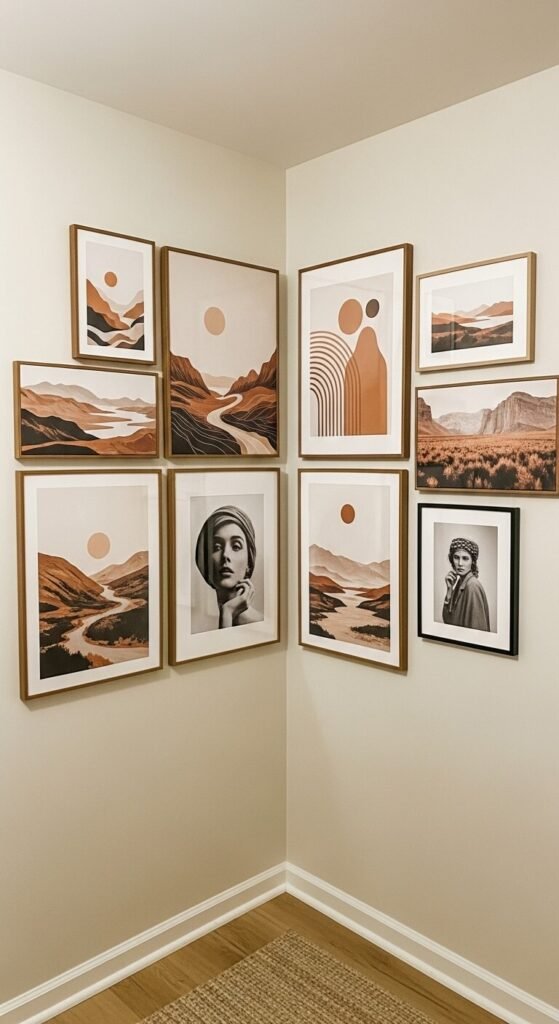
Don’t let corners stop your creativity. Wrap your gallery around corners to connect two walls visually. This works beautifully in small rooms, making spaces feel larger and more cohesive. Start with a strong piece on each wall near the corner, then fill in around them. Keep spacing consistent as you turn the corner. This technique works well with matching frames to maintain flow. It’s perfect for showcasing vacation photos or a themed collection that tells a continuous story.
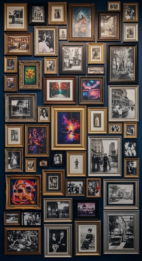
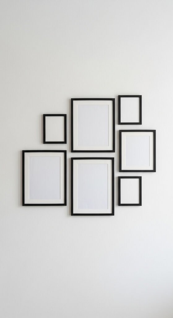
Scattered Organic Layout
Embrace controlled chaos with scattered arrangements. This casual style mimics photos tossed on a bulletin board but requires careful planning. Vary your spacing—some frames touch, others float alone. Mix frame colors and orientations freely. The key is balancing visual weight: place larger, darker frames throughout to anchor the design. This layout grows easily over time as you add new memories. Use removable adhesive hooks for flexibility. Perfect for creative spaces, kids’ rooms, or casual family areas.
Ledge Shelf Gallery
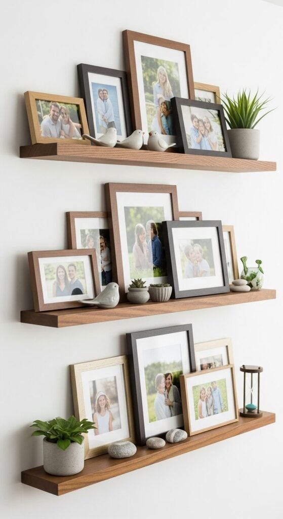
Skip the nails with ledge shelves. Mount narrow floating shelves and lean frames against the wall. This lets you rotate photos seasonally without making new holes. Overlap frames for depth and interest. Mix in small plants, candles, or books between frames. This works wonderfully above consoles, beds, or in entryways. You can find affordable ledge shelves for $10-15 each. The layered look feels collected and personal. Rearrange whenever the mood strikes—no tools required.
Monochromatic Theme Wall
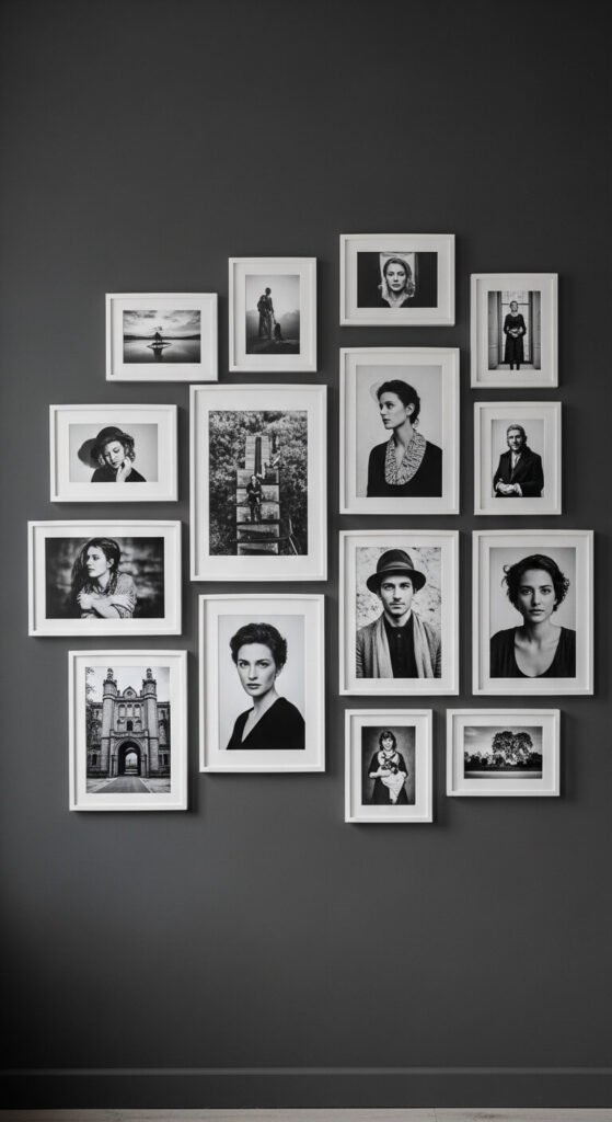
Unify diverse images with matching frames and color schemes. Choose one frame color and stick with it—black, white, or natural wood. Then select photos in matching tones: all black and white, all warm sepia, or all cool blues. This creates cohesion even when mixing landscapes, portraits, and abstract art. The limited palette feels sophisticated and intentional. You can collect frames slowly since they all match. This approach works anywhere and costs less since you’re not buying specialty frames.
Over-the-Furniture Float
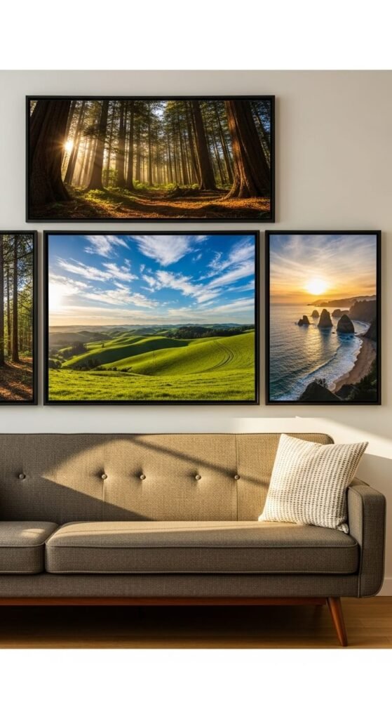
Scale your gallery to your furniture. Frames above sofas or beds should span two-thirds to three-quarters of the furniture width. Hang the bottom edge 6-8 inches above the furniture. Use three to five frames in a horizontal row or a small cluster. This creates visual connection between your wall and furniture. Measure your sofa or headboard first, then choose frame sizes accordingly. This prevents the “floating in space” look and makes rooms feel finished and intentional.
Vertical Column Display
Go vertical in narrow spaces. Stack frames in a single column beside doorways, in hallway ends, or on thin wall sections. This arrangement draws eyes upward, making ceilings feel higher. Use identical frames for clean impact. Space them evenly—three to four inches apart works well. This layout suits long vertical photos or themed collections like botanical prints or vintage postcards. It’s perfect for rental-friendly Command strips since weight distributes across multiple hooks. Great for small spaces where horizontal room is limited.
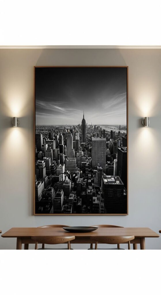
Oversized Statement Piece
Sometimes less is more. One oversized piece makes a powerful statement without the fuss of arranging multiple frames. Look for canvas prints 36×48 inches or larger. This works beautifully in dining rooms, above beds, or in living rooms. You can find affordable large prints at home stores or print your own photos through online services. A single piece feels modern and minimalist while filling wall space effectively. Installation is simpler—just two hooks and you’re done.
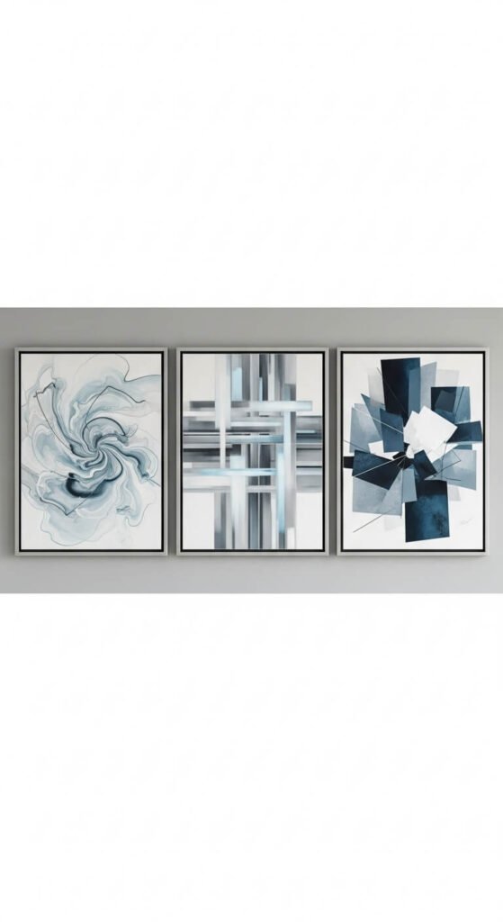
Matching Trio Set
Three matching frames create instant style. Arrange them horizontally or vertically with equal spacing. This works with matching matted prints, a three-part photo series, or coordinating artwork. The repetition feels intentional and polished. Measure the total width and divide by three to ensure even spacing. You can buy pre-made triptych sets affordably or create your own. This layout works above consoles, in bathrooms, or flanking windows. Simple to install and always looks professional.
Asymmetrical Balance Layout
Balance doesn’t require symmetry. Create visual equilibrium by distributing weight evenly across your wall. Place larger, darker frames on one side, balanced by multiple smaller frames opposite. Imagine a center line and keep visual weight equal on both sides. This feels modern and collected. Sketch your layout on paper first, cutting out shapes to represent each frame. Rearrange until it feels balanced. This takes practice but creates the most interesting, personalized galleries.
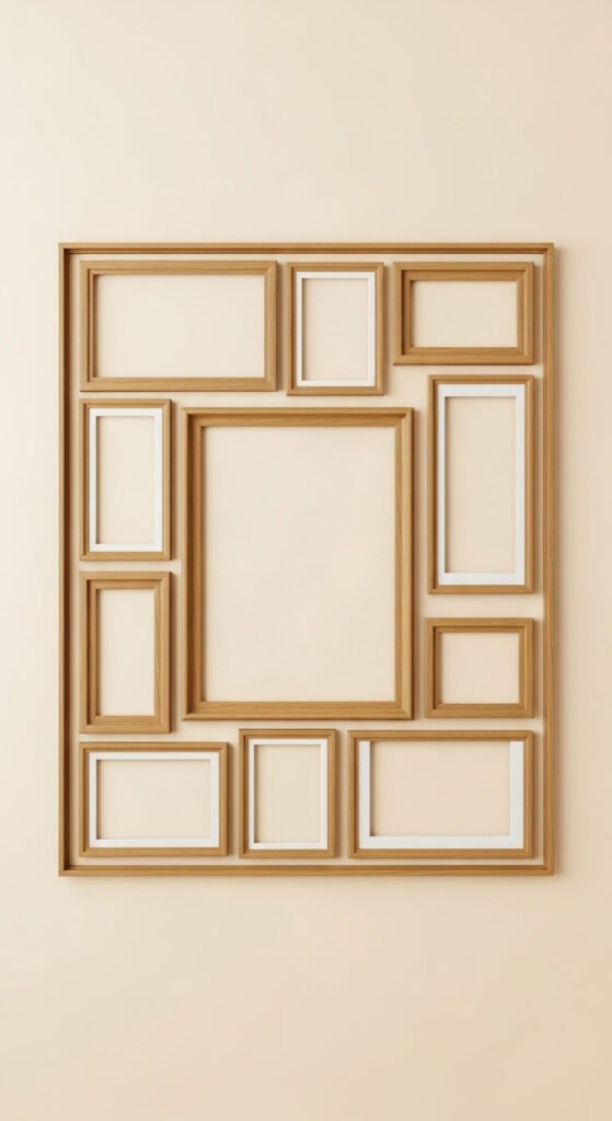
Rectangular Frame Within Space
Create invisible boundaries for cohesive displays. Arrange frames so they collectively form a rectangle shape, leaving equal margins on all sides. This contains your gallery within defined limits, preventing sprawl. Map out your rectangle with painter’s tape first—common sizes are 36×48 or 48×60 inches. Fill the interior with varied frame sizes, keeping all frames within the boundary. This technique works anywhere and makes groupings feel professional and purposeful, even with mismatched frames inside.
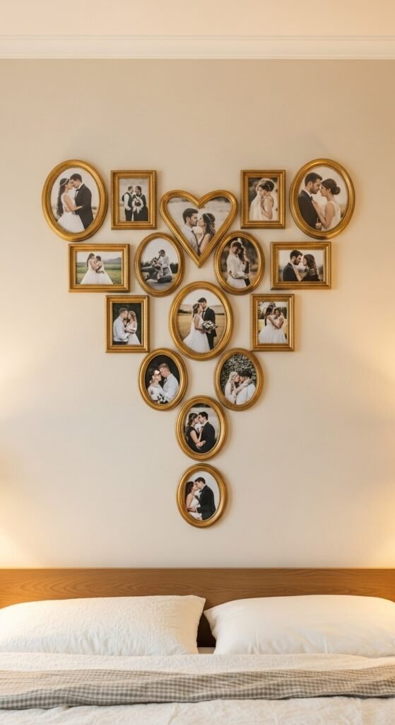
Heart-Shaped Arrangement
Shape your memories into meaningful forms. Arrange frames to create hearts, stars, initials, or other symbols. This works beautifully in bedrooms, nurseries, or as anniversary gifts. Start with the outline frames, then fill in the center. Use painter’s tape to map your shape on the wall first. This takes patience but creates unique, conversation-starting displays. Works well with smaller frames since you can control the shape more precisely. Perfect for special occasions or themed rooms.
Floating Frame Clusters
Break up large walls with separated clusters. Instead of one big gallery, create several small groupings spread across your wall. Each cluster should contain 2-4 closely spaced frames. Leave generous space between clusters—12-18 inches minimum. This prevents walls from feeling cluttered while still filling space. Each cluster can represent different themes or time periods. This approach works well in large living rooms or along long hallways where one massive gallery would overwhelm.
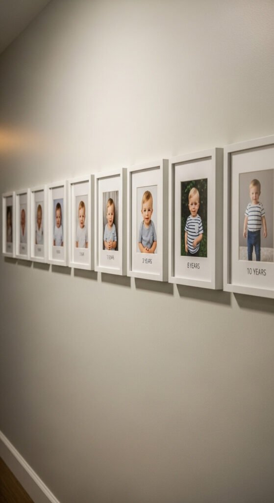
Timeline Story Wall
Tell your story chronologically. Arrange photos in timeline order from left to right or bottom to top. This works beautifully for baby’s first year, relationship milestones, or family growth. Use matching frames to emphasize the progression. Label each frame with dates using small plaques or written on mats. This creates narrative meaning beyond decoration. Kids love seeing themselves grow up along hallway walls. Add new frames as time passes, extending your story indefinitely.
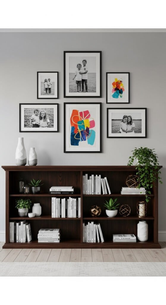
Behind-the-Furniture Stack
Use wall space above low furniture creatively. Hang frames in the section between your bookshelf or cabinet and the ceiling. This maximizes unused vertical space. The frames appear to float above furniture, adding height and interest. Keep arrangements simple here—three to five frames work best. This trick makes rooms feel taller and more complete. Works well with low consoles, bookcases, or storage units. Just ensure frames don’t overwhelm the furniture below.
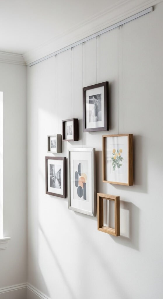
Picture Rail System
Install a picture rail for ultimate flexibility. Mount a rail near your ceiling and hang frames from wires or cords. This protects walls from holes and lets you rearrange endlessly. Picture rails work beautifully in rentals or if you change decor frequently. You can slide frames along the rail or adjust hanging heights easily. The system costs $30-50 for a 6-foot rail but saves money long-term since frames hang without nails. Looks clean and gallery-quality.
Diagonal Line Pattern
Break the grid with diagonal lines. Arrange frames along an angled axis from one corner toward another. This creates energy and movement that horizontal rows can’t match. Keep frames aligned along your invisible diagonal line for cohesion. This works well in modern spaces or creative rooms. Use lighter frames and smaller sizes to prevent the arrangement from feeling heavy or unstable. Map your line with tape first to ensure straight alignment despite the angle.
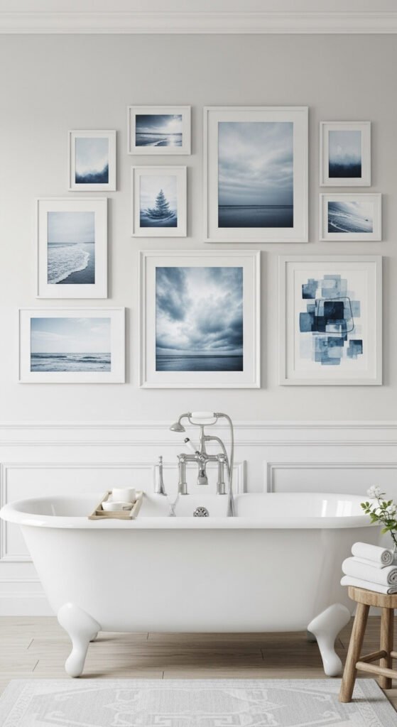
Themed Color Story
Let color unify your collection. Choose frames and images in one color family—all blues, warm earth tones, or pastels. This creates cohesion even with different subjects and styles. Mix landscapes, portraits, and abstracts freely as long as colors coordinate. This approach works beautifully in bedrooms and bathrooms where you want calming atmosphere. You can thrift mismatched frames and spray paint them the same color for under $20 total. The color story makes everything feel intentionally curated.
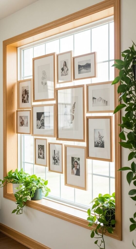
Window-Adjacent Display
Frame your windows with photos. Arrange your gallery around windows, using the window as part of your overall design. Place frames above, beside, or below windows to create architectural interest. This draws attention to natural light while adding personality. Keep spacing consistent between frames and window edges. This works especially well with smaller windows that feel awkward alone on large walls. The combination of natural light and photos creates dynamic, changing displays throughout the day.
Minimalist Five-Frame Classic
Keep it simple with five frames. Arrange one center frame with four matching frames around it—above, below, and on each side. This plus-sign configuration feels balanced and approachable. Use identical frames for the outer four, with a slightly larger center piece. This layout works anywhere and takes 20 minutes to install. Perfect for beginners who want polish without complexity. Measure carefully to ensure equal spacing on all sides of the center frame.
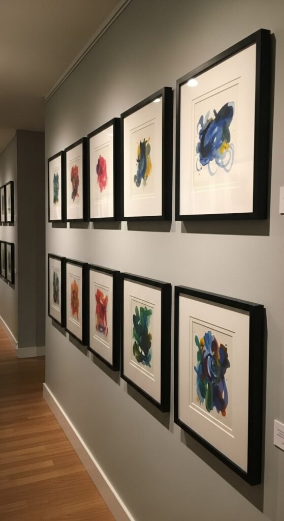
Double-Row Gallery
Create museum-quality displays with double rows. Hang two parallel rows of frames with consistent spacing between them. Keep frames in each row identical in size and style. This works beautifully in hallways or above long furniture. The repetition feels professional and polished. Maintain 4-6 inches between rows. This layout suits large photo collections where single rows feel cramped. You can extend rows indefinitely, adding frames as your collection grows. Simple geometry makes installation straightforward.
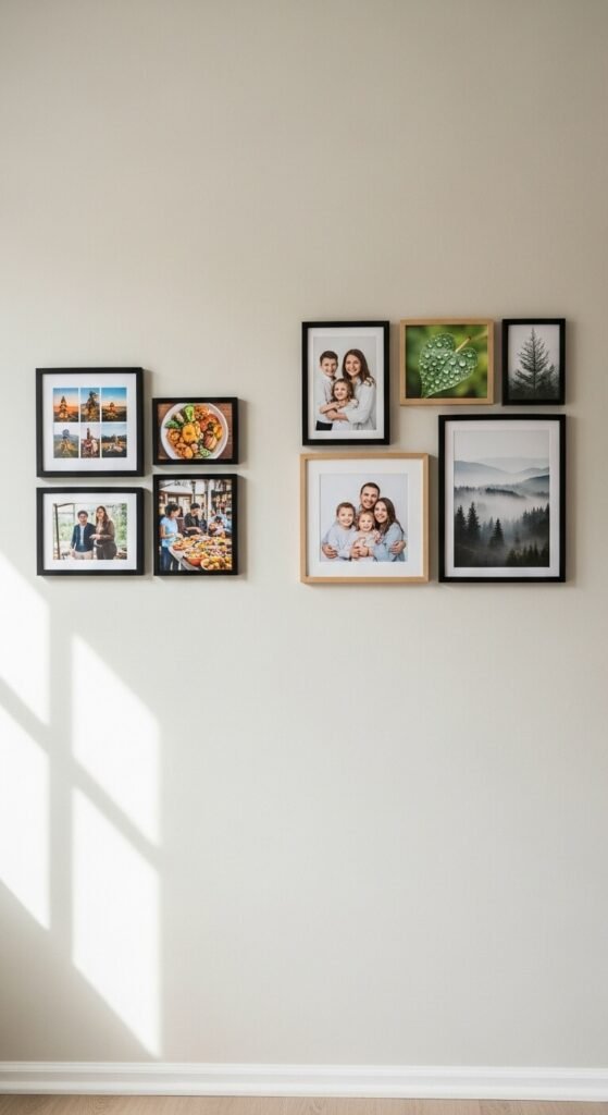
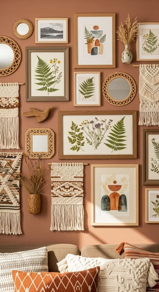
Mixed Media Wall
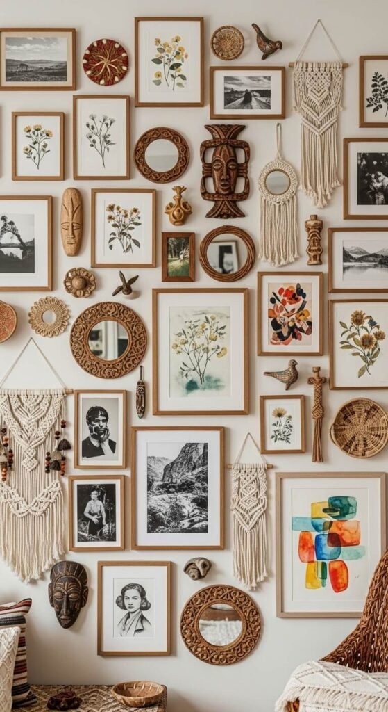
Mix photos with other wall decor. Combine framed photos with mirrors, shelves, textiles, or sculptural pieces. This adds dimension and texture beyond flat frames. Start with your photos as the foundation, then add complementary objects. Space everything like a traditional gallery wall, maintaining consistent gaps. This approach feels collected and personal. Thrift stores offer affordable mirrors and small art objects. The mixed media approach lets you showcase hobbies, travel souvenirs, and memories together creatively.
Conclusion
Gallery walls don’t require professional help or big budgets. Start with what you have—family photos, vacation snapshots, or thrift store art. Choose a layout that fits your space and style. Measure twice, hang once, and don’t stress over perfection. Your memories deserve to be displayed, not hidden in drawers. Pick one layout from this guide, gather your frames, and spend this weekend creating a wall that tells your story. The most beautiful galleries are personal ones that make you smile every time you walk past them.