Ever walked into a room — or seen an outfit — where stripes, florals, and geometric prints somehow lived together in perfect harmony? It looked effortless, intentional, and undeniably stylish. Now think about the times you tried to recreate that look and it felt more like a kindergarten art project gone wrong. The difference between “designer-curated” and “visual mess” isn’t talent — it’s knowing a few simple rules.
Good news: pattern mixing is a learnable skill. Here’s exactly how to do it without losing your mind — or your aesthetic.
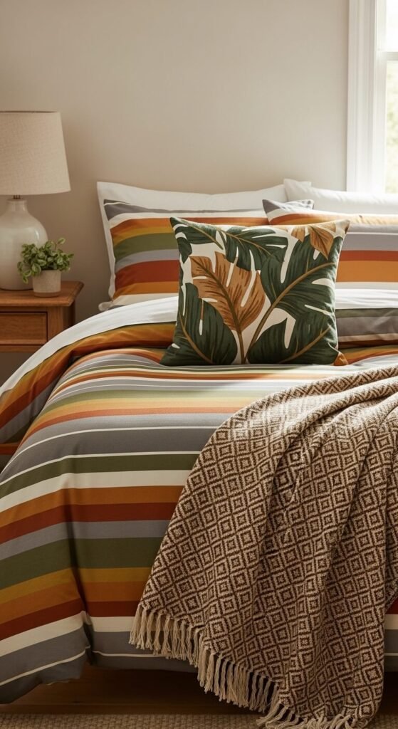
Start With a Unified Color Palette
This is the golden rule that designers swear by. Before you think about which patterns to mix, nail down your color story first.
- Choose 2–3 anchor colors that will repeat across all your patterns.
- Neutrals (cream, tan, grey, black) are your best friends — they let louder prints breathe.
- Pull colors from one hero piece (a bold rug, a printed fabric) and build around it.
When your patterns share even one common color, the eye reads them as intentional rather than chaotic. It’s the invisible thread that ties everything together.
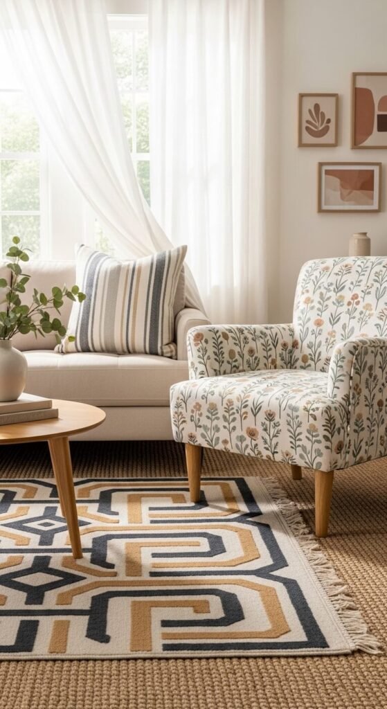
Vary the Scale of Your Patterns
Here’s where most people go wrong: they mix patterns of the same size and wonder why it looks busy. The secret is contrast in scale.
Think of it as a trio:
- Large — a bold floral or oversized plaid
- Medium — a classic stripe or mid-scale geometric
- Small — a tiny ditsy print or fine check
When these three scales sit together, each pattern has room to “speak” without competing. The eye naturally moves between them rather than getting stuck.
Use the 60-30-10 Rule
Interior designers use this ratio to balance color — and it works just as brilliantly for patterns.
- 60% of your space (or outfit) = your dominant pattern or solid
- 30% = a secondary pattern that complements
- 10% = an accent pattern for a pop of personality
This keeps one pattern from overwhelming the others. Think of it as a visual hierarchy — a lead singer with two backup vocalists, not three people fighting for the mic.
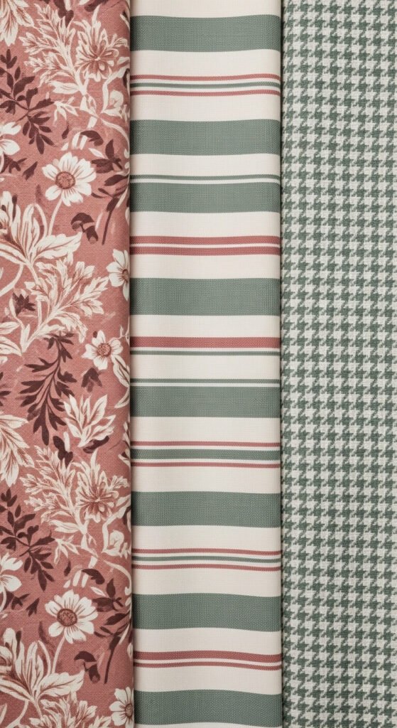
Mix Pattern Types, Not Just Colors
Don’t be afraid to combine different families of pattern. In fact, that’s what makes a mix feel curated rather than matchy-matchy.
Great combos include:
- Stripes + florals — the classic pairing that never fails
- Geometric + organic — structured meets nature-inspired
- Animal print + abstract — edgy, unexpected, and surprisingly chic
- Plaid + solid texture — technically a “pattern” play even without a busy print
The key is that each pattern has a different visual energy — one is linear, one is curved, one is organic. That contrast creates interest without confusion.
Ground It With Solids and Texture
Even the most confident pattern mixer knows when to stop. Solids and textures act as visual rests — they give the eye a moment to breathe before jumping to the next pattern.
- A plain linen cushion between two printed ones = instant calm.
- A solid-colored wall lets a patterned sofa become the star.
- Textured neutrals (bouclé, jute, velvet) add depth without adding more print.
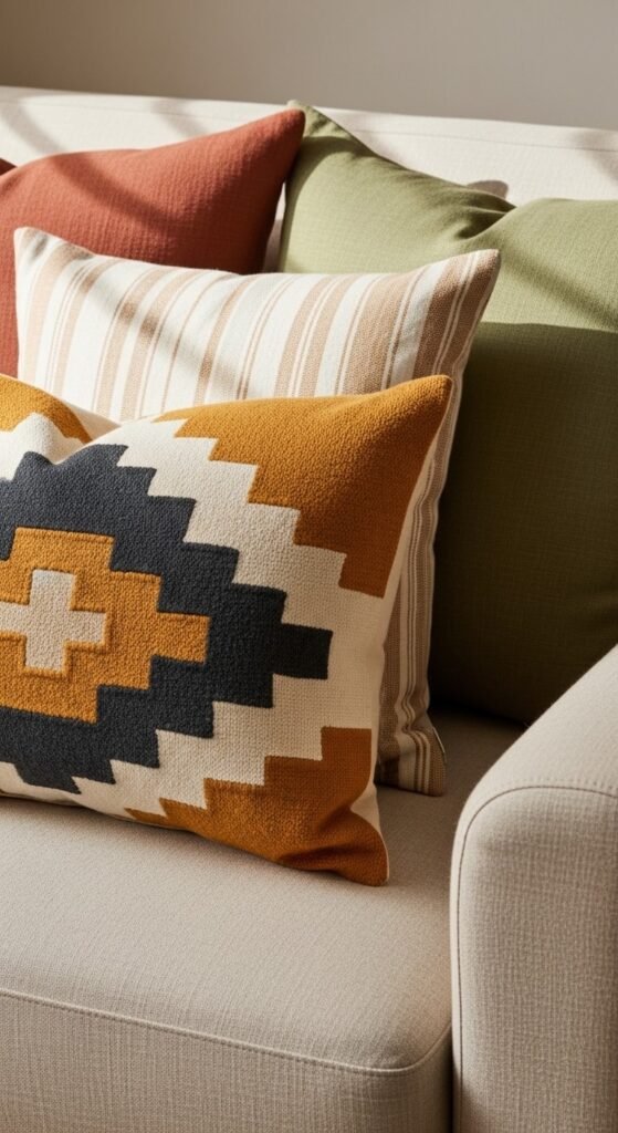
When in doubt, add a solid. It’s the editing move that separates the great from the good.
Trust Your Eye — Then Step Back
After you’ve layered your patterns, do the “squint test.” Step back, squint your eyes, and look at the overall composition. Does it feel balanced? Does one area feel too heavy or too empty?
Designing with patterns is part formula, part intuition. The rules above give you structure — but your eye is the final editor.
The Takeaway
Mixing patterns isn’t about being fearless — it’s about being smart. Stick to a shared color palette, vary your scales, balance your ratios, and always let a solid anchor the mix. Once these habits become second nature, you’ll wonder why you ever played it safe with matching prints.