You know that feeling when you finally install those beautiful floating shelves you’ve been eyeing, only to stand there completely paralyzed about what to put on them? Or worse—you fill them up with random stuff, step back, and realize they look like a chaotic thrift store explosion? Trust me, you’re not alone. Floating shelves have this magical ability to either make a room feel curated and intentional or like you just dumped your junk drawer onto the wall.
The good news? With a few simple styling rules, you can transform those shelves from cluttered chaos to Pinterest-worthy perfection. Let’s dive into exactly how to make your floating shelves look effortlessly chic without the mess or the “meh.”
Start With the Rule of Three
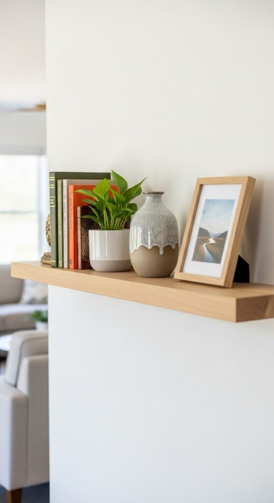
Here’s a designer secret that’ll change your shelf game forever: things look better in groups of three. It’s called the “rule of three,” and it works because our brains find odd numbers more visually interesting than even numbers.
When styling your shelves, think in clusters of three items. This could be:
- Three books stacked horizontally
- A trio of small plants at varying heights
- Three picture frames in different sizes
You don’t need to have everything in literal threes, but using this as your foundation creates natural rhythm and keeps things from feeling too symmetrical (which can read as boring) or too chaotic.
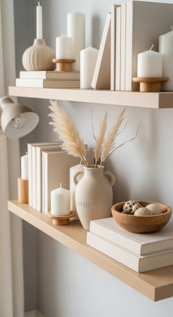
Mix Heights, Textures, and Shapes
This is where the magic happens. If everything on your shelf is the same height and made from the same material, your eye has nowhere to travel—it just sees one flat, boring blob. Instead, create visual interest by mixing:
Heights: Combine tall candlesticks with short bowls, or stack books to create platforms for smaller objects.
Textures: Pair smooth ceramic pieces with woven baskets, glass vases with wooden frames, or metallic accents with natural greenery.
Shapes: Round bowls next to rectangular books, cylindrical vases beside square picture frames—you get the idea.
The key is creating contrast so each item stands out while still feeling cohesive as a group.
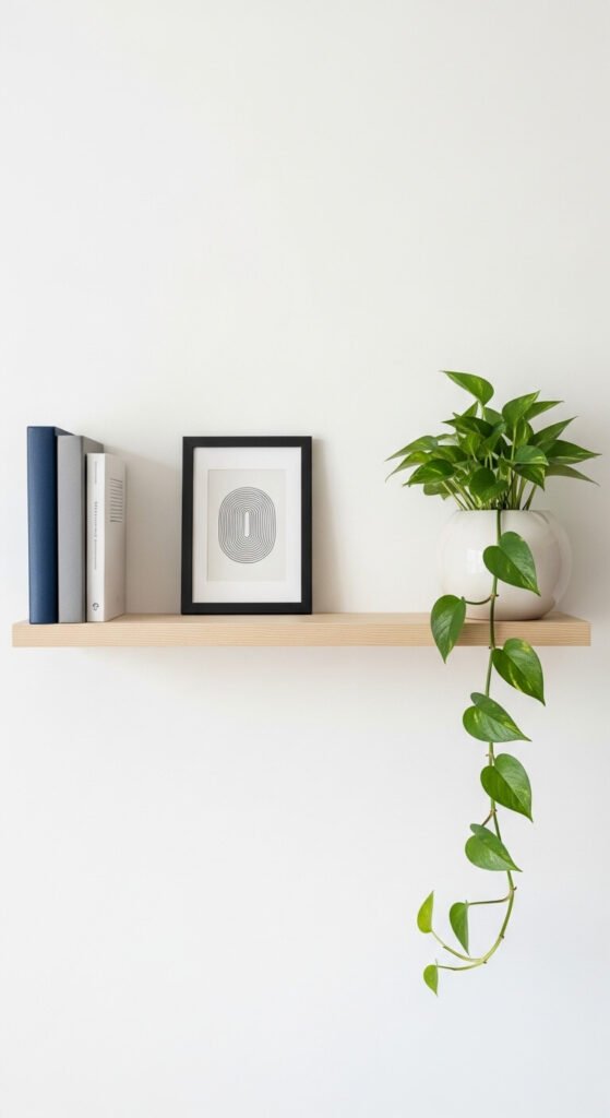
Leave Breathing Room (Seriously!)
Here’s where most people go wrong: they fill every single inch of shelf space. But here’s the truth—negative space is just as important as the objects themselves. Empty space gives your eyes a place to rest and makes your carefully chosen items stand out.
A good rule of thumb? Fill about 60-70% of your shelf space, leaving 30-40% empty. This might feel wrong at first (hello, wasted space!), but it’s what separates a styled shelf from a storage shelf.
Create Visual Balance Without Perfect Symmetry
Think of your shelf like a seesaw. You want both sides to feel balanced, but that doesn’t mean they need to be identical. If you have a large vase on the left side, balance it with a stack of books and a small plant on the right. The goal is visual weight, not mirror images.
Try the “squint test”: step back and squint at your shelf. Does one side feel heavier than the other? Adjust until it feels even, even if the actual items are completely different.
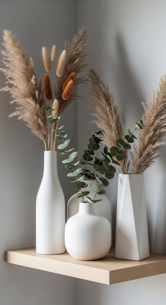
Add Living Elements
This is the easiest way to make any shelf instantly feel fresh and intentional: add plants. Real or faux (no judgment), greenery brings life and softness to your styling. Trailing plants like pothos or string of pearls work beautifully on floating shelves, adding that organic, Pinterest-worthy touch.
Other living elements to consider:
- Fresh flowers in a simple vase
- Dried pampas grass or eucalyptus
- Small succulents in decorative pots
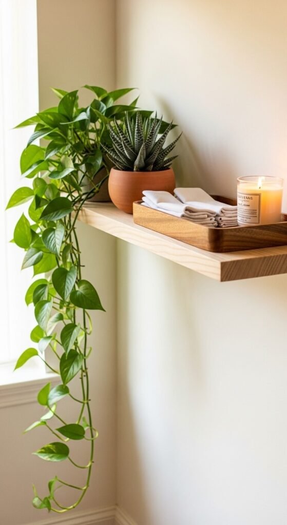
Layer Items Front to Back
Don’t just line everything up in a single row like soldiers. Create depth by layering items from front to back. Lean a frame against the wall behind a small bowl or stack. Place a smaller object in front of a larger one. This layering technique adds dimension and makes your shelf feel more curated and less “stuff on a wall.”
Stick to a Color Palette
Want to know the fastest way to make your shelves look cohesive instead of chaotic? Choose a color palette and stick to it. This doesn’t mean everything needs to be the same color, but having a general theme (like whites and naturals, or blues and brass, or moody blacks and greens) ties everything together visually.
Most successful shelf styling sticks to 3-4 main colors plus neutrals. This gives you enough variety to keep things interesting while maintaining a pulled-together look.
The Final Touch: Edit Ruthlessly
Once you’ve styled your shelves, step back and take a photo with your phone. Sometimes we can see things more clearly in a picture. Then ask yourself: does anything look out of place? Is there too much going on? Could I remove one item and have it look better?
The best-styled shelves often come from removing things, not adding more. When in doubt, take something away.
Your floating shelves should feel like a curated collection, not a storage solution. With these simple rules—grouping in threes, mixing heights and textures, leaving breathing room, and sticking to a color palette—you’ll create shelves that look intentional, elevated, and anything but boring or messy.