Walk into a room painted deep navy blue and feel your shoulders drop. Step into one washed in warm terracotta and suddenly you’re craving a glass of wine and good conversation. Color isn’t just decoration — it’s emotion on your walls. If you’ve ever stood frozen in the paint aisle holding seventeen swatches and feeling completely overwhelmed, this guide is your way out. Let’s make choosing wall color the most fun (and intentional) decision in your whole home.
Understand How Color Actually Affects Mood
Before you pick up a single swatch, it helps to know what colors do to a space psychologically. This isn’t guesswork — it’s science-backed and designer-approved.
- Warm tones (reds, oranges, yellows, terracottas) energize, stimulate conversation, and make spaces feel cozy and intimate. Great for dining rooms and living areas.
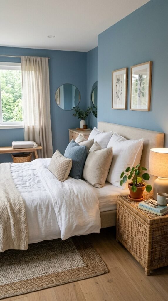
- Cool tones (blues, greens, purples, grays) calm the nervous system, lower perceived temperature, and promote focus or rest. Ideal for bedrooms and home offices.
- Neutrals (whites, beiges, warm grays) create flexibility, making rooms feel larger and letting furniture do the talking.
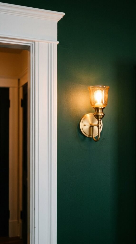
- Deep, saturated hues (forest green, navy, charcoal) add drama and sophistication — they make a room feel intentional and cocooning rather than cold.
The key insight: there are no universally “bad” colors, only colors that are wrong for that room’s purpose.
Match the Color to the Room’s Job
Each room in your home has a function, and your wall color should support — not fight — that function.
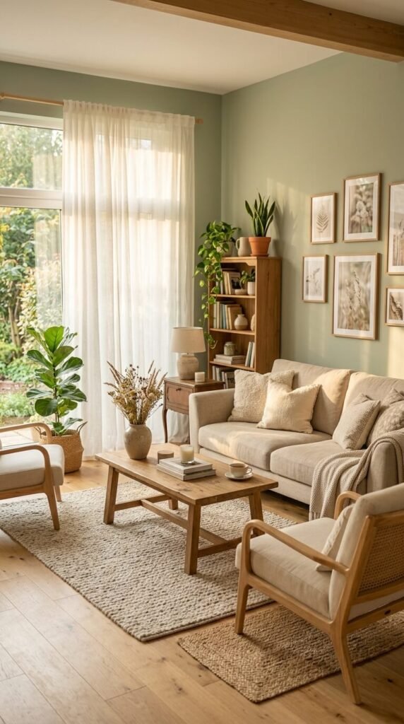
Living Room: This is a social hub. Warm whites, greiges, soft terracottas, or muted olive greens create welcoming energy without overwhelming guests.
Bedroom: Your sleep sanctuary deserves calming shades. Think dusty blue, lavender-gray, soft sage, or warm taupe. Avoid anything too bright or stimulating — you want your brain to slow down here.
Kitchen: Bold and bright works beautifully here. Crisp white keeps it clean and classic. Sunny yellow or terracotta adds energy for morning coffee. Even a bold navy island against white walls is a show-stopper.
Home Office: Focus is the goal. Muted greens (think eucalyptus or sage) are proven to reduce eye fatigue. Soft blues promote calm productivity. Avoid overly stimulating reds or too-cheerful yellows if deep work is on the agenda.
Bathroom: Small bathrooms love light, airy colors to open up the space. But don’t be afraid of a deep, moody hue in a powder room — dark walls in a small space can feel luxurious rather than claustrophobic.
Factor in Light Before You Commit
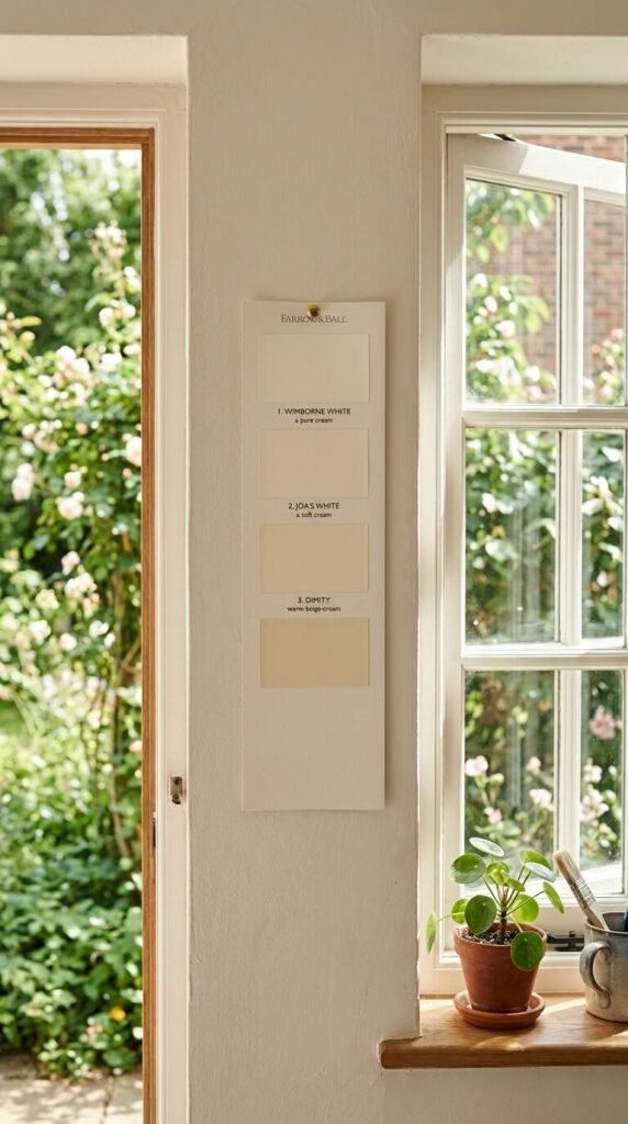
Here’s the most common mistake people make: choosing a color they loved on a tiny swatch under fluorescent store lighting, then watching it look completely different at home.
- North-facing rooms get cool, indirect light — warm up the space with creamy whites, soft yellows, or warm greiges.
- South-facing rooms are bathed in warm light all day — they can handle cooler tones without feeling icy.
- East-facing rooms get bright morning light that fades by afternoon — go warm to keep the glow going.
- West-facing rooms get dramatic golden evening light — great for rich, warm tones that come alive at dusk.
Pro tip: Always test a large paint swatch (at least A4 size) on the actual wall and observe it at different times of day before buying a full can.
Use the 60-30-10 Rule for Balance
Once you’ve chosen your wall color, balance it within the room using this classic design formula:
- 60% — Your dominant wall color
- 30% — A secondary color (furniture, rugs, curtains)
- 10% — An accent color (throw pillows, art, hardware, plants)
This prevents any one color from overwhelming the space and creates visual harmony that feels curated, not accidental.
Don’t Ignore the Finish
The sheen of your paint matters as much as the color itself.
- Matte/flat — Hides imperfections, creates a sophisticated, velvety look. Best for bedrooms and low-traffic areas.
- Eggshell/satin — Slight sheen, easy to wipe clean. The go-to for living rooms and hallways.
- Semi-gloss/gloss — Highly reflective, very durable. Perfect for kitchens, bathrooms, and trim work.
Start Small if You’re Nervous
Not ready to commit to four full walls? Ease in with an accent wall behind the bed or sofa. Or try painting built-in shelving, a fireplace surround, or even just the ceiling for unexpected drama with minimal risk.
Color drenching — painting walls, trim, and ceiling the same shade — is also having a major moment and is actually easier to pull off than mixing multiple tones.
The Bottom Line
The perfect wall color isn’t the one that’s trending on Pinterest right now — it’s the one that makes you feel exactly the way you want to feel when you walk into that room. Start with the mood, consider the light, respect the room’s purpose, and test before you commit.
Save this guide for your next renovation and share it with a friend who’s staring at paint swatches right now — you might just save them from a regrettable beige.