Ever walked into a room and immediately felt something was off — even though you couldn’t quite put your finger on it? Chances are, the colors were fighting each other. The good news? Interior designers have a simple, foolproof formula that fixes exactly that. It’s called the 60-30-10 rule, and once you learn it, you’ll never look at a room the same way again.
What Is the 60-30-10 Rule?
It’s as simple as it sounds. When decorating any space, divide your colors into three parts:
- 60% — Your dominant color (the background)
- 30% — Your secondary color (the supporting player)
- 10% — Your accent color (the pop of personality)
Think of it like a well-tailored outfit: 60% is your pants and jacket, 30% is your shirt, and 10% is that bold tie or statement earrings. Each element plays a distinct role, and together they create a look that feels intentional and balanced.
Step 1: Choose Your 60% — The Dominant Color
This is the color that will carry the room. It lives on your walls, large rugs, and major upholstered furniture like sofas or sectionals.
Because it covers the most visual space, your dominant color should be:
- Neutral or calming (think warm whites, soft grays, earthy beiges, or muted greens)
- A shade you genuinely love — you’ll be seeing a lot of it
- Complementary to the natural light in the room
Don’t be afraid of color here. Soft blues, warm taupes, and even pale blush tones work beautifully as dominant hues.
Step 2: Pick Your 30% — The Secondary Color
The secondary color is where the room starts to get interesting. This shows up in:
- Curtains and window treatments
- Secondary seating like armchairs or ottomans
- Bedding or large throw blankets
- An accent wall or large piece of furniture
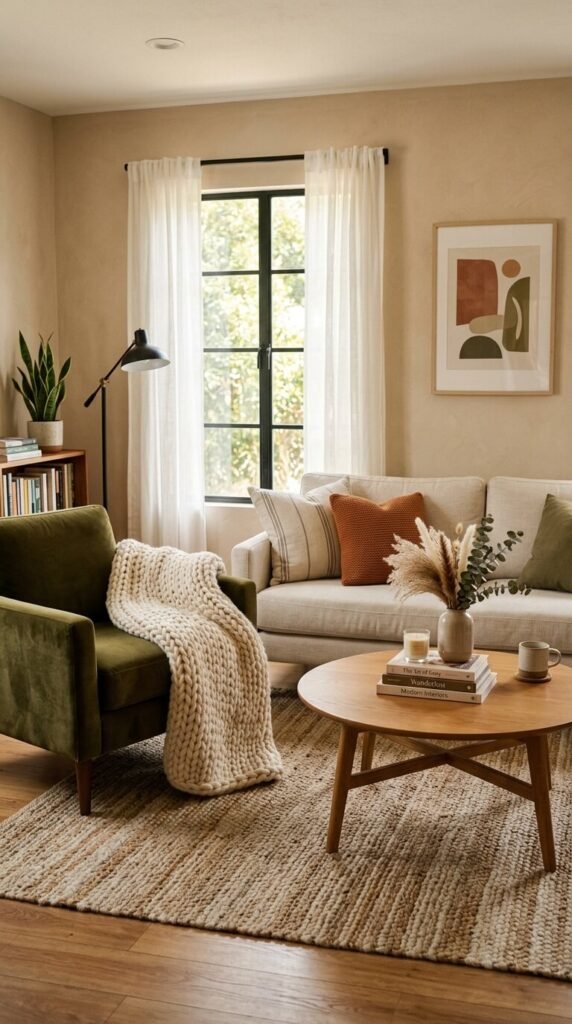
Your 30% color should complement the dominant color without competing with it. If your dominant color is warm beige, a dusty terracotta or olive green makes a perfect secondary. If your dominant is cool gray, a soft navy or sage pairs beautifully.
A great trick: look at a color wheel and choose colors that sit next to each other (analogous) or directly across (complementary) for a designer-approved look.
Step 3: Add Your 10% — The Accent Color
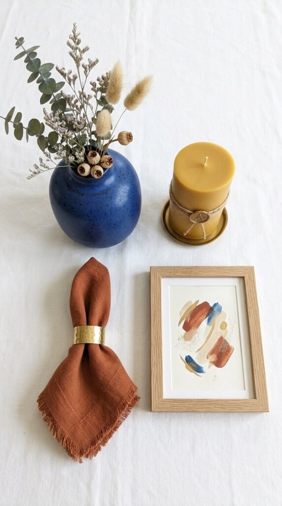
This is the fun part. Your accent color is where you inject personality, energy, and surprise. Use it in:
- Throw pillows and blankets
- Vases, candles, or decorative objects
- Artwork or a statement lamp
- A single painted door or window frame
Because it’s only 10% of the room, your accent can be bold — think mustard yellow, burnt orange, cobalt blue, or deep emerald. This small dose of drama is exactly what makes a room feel styled rather than just decorated.
Pro tip: Repeat your accent color in at least two to three spots around the room so it feels intentional, not random.
How to Put It All Together
Here’s a quick example of the rule in action:
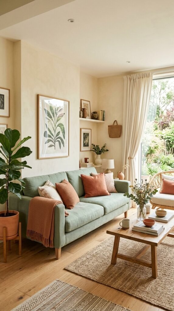
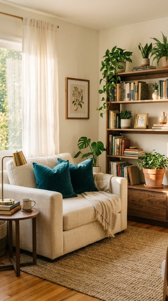
Room: Living Room
- 60% (walls + sofa): Warm ivory white
- 30% (armchair + curtains): Soft terracotta
- 10% (pillows + vase + art): Deep forest green
See how each color supports the next without overpowering it? The ivory keeps things airy, the terracotta adds warmth, and the green grounds the whole palette with a natural, organic feel.
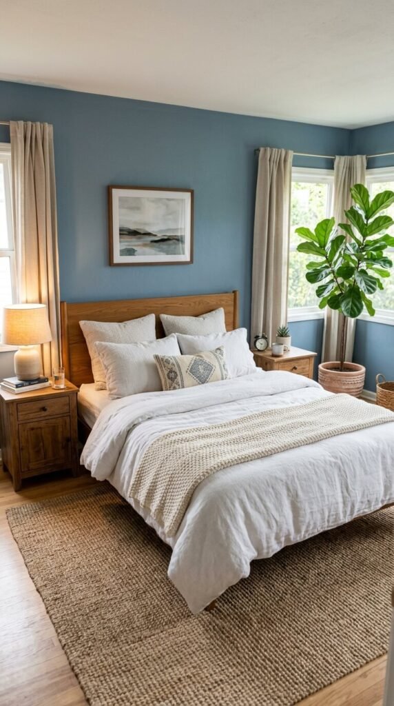
You can apply this same logic to bedrooms, kitchens, home offices, and even bathrooms — the formula works everywhere.
Common Mistakes to Avoid
- Going 50/50 on two colors — it creates visual tension and makes a room feel unsettled
- Using your accent color everywhere — it loses its impact and starts to feel overwhelming
- Forgetting about texture — within each color percentage, vary your textures (linen, wood, ceramic, velvet) to add depth
- Ignoring undertones — a “white” wall with pink undertones will clash with a “white” sofa with yellow undertones
The Bottom Line
The 60-30-10 rule isn’t about being rigid — it’s about giving yourself a framework that makes color decisions easier. Once you have your three colors locked in, every purchase becomes simpler. Does that pillow fit my 10%? Does this rug support my 60%? Suddenly, decorating feels less overwhelming and a lot more fun.
Ready to transform your space? Grab a paint chip, pull three colors you love, and start playing with proportions. Save this guide for your next decorating project — and share it with a friend who’s been staring at paint swatches for way too long. 🎨