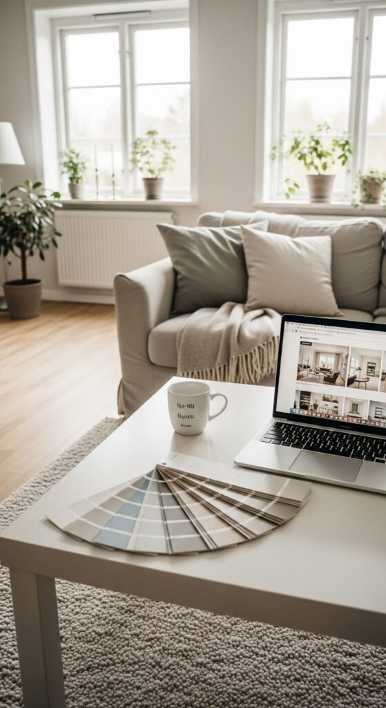
You’re standing in the paint aisle, clutching three nearly-identical white swatches, wondering if “Alabaster” is really that different from “Swiss Coffee.” Fast forward two weeks: your freshly painted living room looks nothing like you imagined, and you’re already eyeing the roller with regret.
Sound familiar? You’re not alone. Choosing paint colors ranks as one of the most anxiety-inducing home decisions, right up there with cutting your own bangs. But here’s the good news: interior designers have a proven formula for selecting colors they (and their clients) actually love long-term. And I’m about to share it with you.
The 60-30-10 Rule: Your Color Foundation
Before you even think about specific shades, you need to understand the designer’s golden ratio: 60-30-10.
Here’s how it breaks down:
- 60% Dominant Color – This is your walls (typically neutral)
- 30% Secondary Color – Your furniture, curtains, or accent walls
- 10% Accent Color – Throw pillows, artwork, decorative objects
This formula creates visual balance and prevents color overwhelm. When you violate it—say, painting all your walls navy blue—that’s usually when regret creeps in. Your dominant color should be something you can live with as a backdrop, not the star of the show.
Test in Your Actual Light (Not the Store’s)
That gorgeous sage green looked perfect under the hardware store’s fluorescent lights. In your north-facing bedroom? Suddenly it’s screaming hospital waiting room.
Here’s what designers actually do:
Purchase sample pots (yes, plural) and paint large swatches—at least 2×2 feet—directly on your walls. Not poster board. Not small squares. Big, bold sections you can actually evaluate.
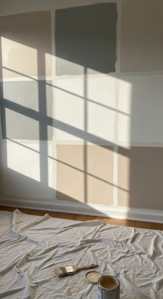
Observe these samples for at least 48 hours. Check them in morning light, afternoon light, and evening with your lamps on. Colors shift dramatically throughout the day, and that “perfect” beige might turn pink at sunset or gray at noon.
Consider Your Undertones (This Is the Game-Changer)
This is where most people go wrong. Every color has an undertone—a subtle hint of another color hiding beneath the surface.
Beiges can lean pink, yellow, or gray. Whites can read blue, green, or peachy. If your undertones clash with your lighting or existing elements (like that oak floor you’re keeping), your paint will always feel “off.”
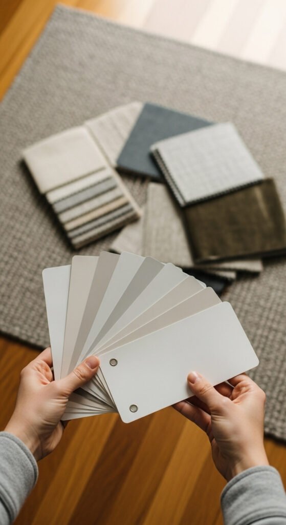
The designer’s trick: Hold your paint swatch next to your fixed elements—flooring, countertops, furniture you’re keeping. Do they play nicely together? If your cool-toned gray tile is fighting with your warm-toned beige paint, you’ve found your problem.
Start with Your Inspiration Piece
Flip the process. Instead of choosing paint first, start with something you absolutely love—a rug, a piece of art, your grandmother’s vintage chair.
Pull colors directly from that piece. If your inspiration has dusty blue and terracotta, those become your color story. This approach practically guarantees cohesion because you’re building around something that already makes your heart happy.
Designers use this method constantly because it removes the guesswork. You’re not choosing colors in a vacuum; you’re creating a curated palette.
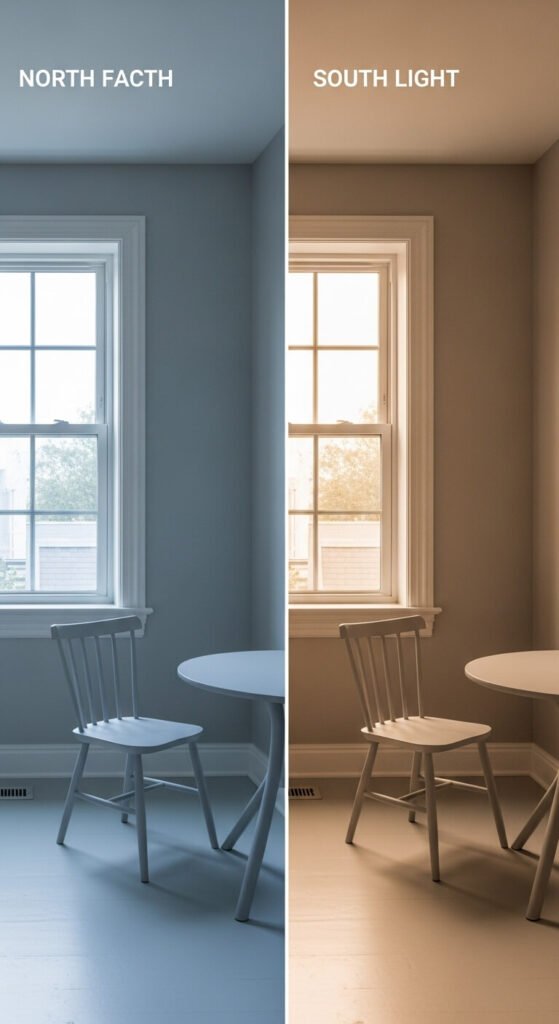
The North/South Face Reality Check
Your home’s orientation isn’t just about sun exposure—it’s about color temperature.
North-facing rooms receive cool, bluish light. They make colors appear darker and can intensify cool undertones. Combat this with warmer paint colors.
South-facing rooms get warm, consistent light all day. They can handle cooler colors beautifully and make warm colors absolutely glow.
East-facing rooms get gorgeous warm morning light that shifts cooler in the afternoon.
West-facing rooms do the opposite—cooler mornings, stunning golden-hour light in the evening.
Choose colors that work with your room’s natural light personality, not against it.
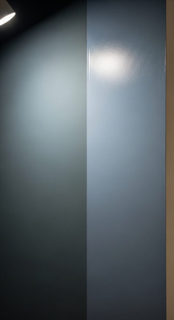
The Finish Matters More Than You Think
Sheen affects how color reads on your walls. The same color in flat versus high-gloss will look completely different.
- Flat/Matte: Hides imperfections, absorbs light, makes colors appear truer but darker
- Eggshell/Satin: Slight sheen, easiest to clean, works almost everywhere
- Semi-gloss/Gloss: Reflects light, makes colors appear lighter and brighter, shows every wall flaw
High-traffic areas like kitchens and bathrooms benefit from washable finishes. Cozy bedrooms shine with flat paint that creates depth.
Your No-Regret Action Plan
Ready to commit? Here’s your step-by-step:
- Identify your room’s orientation and lighting
- Choose your inspiration piece
- Use the 60-30-10 rule to map your colors
- Buy samples and test BIG swatches
- Live with them for 48+ hours minimum
- Check undertones against your fixed elements
- Select your finish based on room function
The secret? Patience. Designers don’t choose paint in one trip. They test, observe, compare, and trust the process.
Your walls are the backdrop to your daily life. They deserve more than a rushed decision in aisle seven. Take the time to get it right, and you’ll walk into your freshly painted room with confidence—not regret.