There’s a secret that every beautifully styled room shares — and it has nothing to do with expensive furniture or a perfectly curated color palette. It’s texture. The quiet layering of rough against smooth, soft against structured, matte against sheen. Done right, texture makes a room feel rich, lived-in, and intentional. Done wrong, it tips into chaos. The good news? The line between the two is easier to walk than you think.
Understand What Texture Actually Does
Before you start shopping, it helps to understand why texture works. When a room lacks texture, it can feel flat — like a photo that hasn’t been edited. Your eye has nowhere to travel, nothing to discover.
Texture creates visual interest without visual noise. It gives a room dimension the same way highlights and shadows give a face definition. The goal isn’t to pile on more stuff — it’s to choose materials that do the heavy lifting quietly.
Think of it this way: a single linen pillow does more for a room than three polyester ones in the same color.
Start with Your Largest Surfaces First
The biggest mistake people make is starting with accessories. Instead, begin with your foundation pieces — floors, walls, and upholstery.
- Rugs: A natural fiber rug (jute, sisal, seagrass) instantly grounds a room with organic texture. Layer a smaller, softer rug on top for depth.
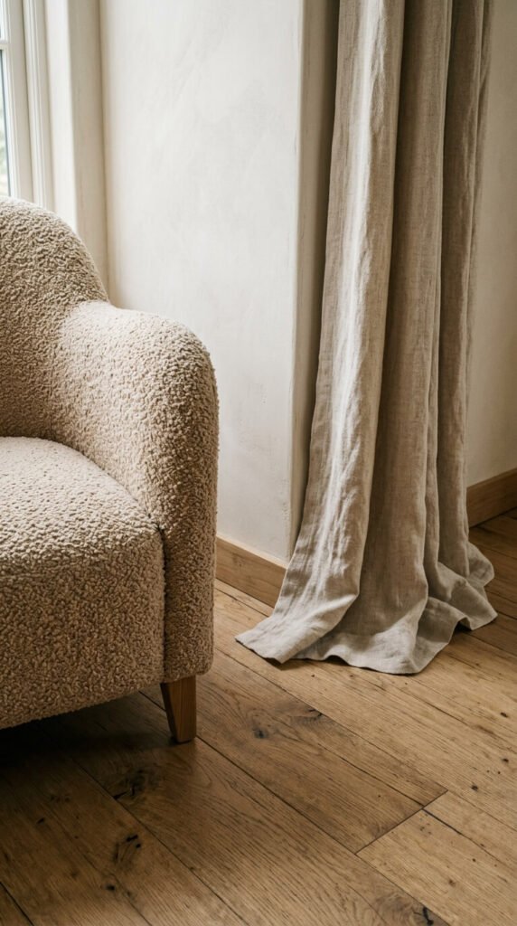
- Upholstery: Linen, boucle, and velvet all photograph and feel completely different, even in the same neutral tone. Mix one smooth piece with one nubby or plush one.
- Walls: You don’t need wallpaper to add texture. Limewash paint, board and batten paneling, or even a gallery wall of mixed-frame materials can add subtle dimension.
Follow the Rule of Three Textures Per Room
A simple framework that prevents overwhelm: limit yourself to three dominant textures per space, then let everything else be neutral.
For example:
- Rough — raw wood, woven baskets, exposed brick
- Soft — a chunky knit throw, velvet cushions, shaggy rug
- Sleek — ceramic, glass, lacquered trays, metal hardware
These three in combination will feel complete. Add a fourth or fifth and things start to compete for attention.
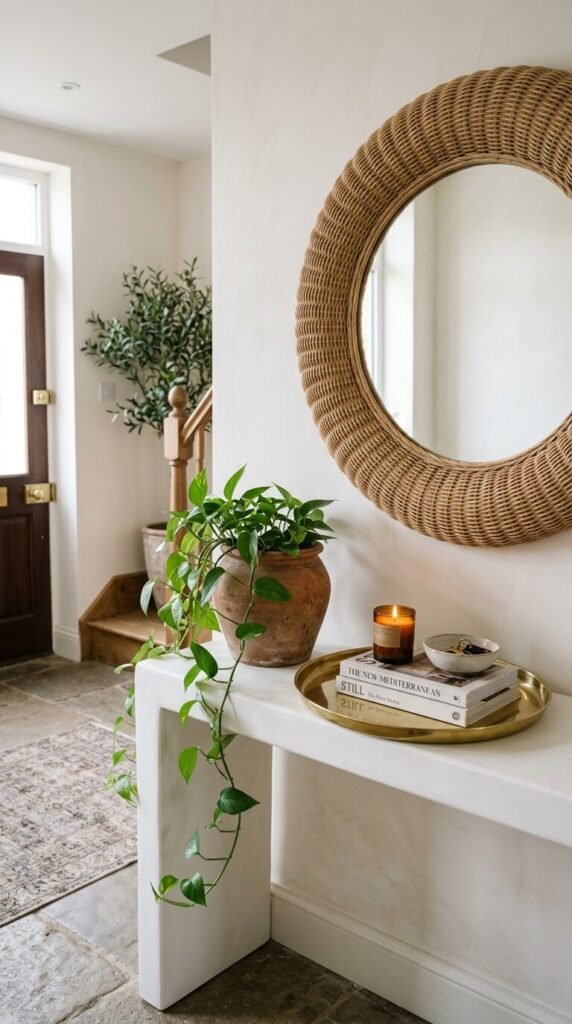
Use Repetition to Unify, Not Multiply
Here’s where most people go wrong: they add texture by adding more items. But repetition is your friend. Using the same material in multiple places ties a room together without adding clutter.
Try this:
- Use the same linen fabric for curtains, a pillow, and a table runner.
- Repeat a woven material in a rug, a basket, and a pendant lampshade.
- Echo a smooth stone in both a vase and a candle holder.
When a texture appears in at least two places, it looks intentional. When it appears in only one, it looks like an accident.
Don’t Forget Contrast — It’s What Makes Texture Visible
Texture only reads when it’s placed next to something different. A room full of soft, fluffy things starts to blur together. A room full of hard, rough surfaces feels cold and uninviting.
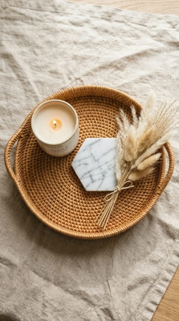
The magic is in the contrast:
- A sleek marble tray on a chunky woven rug
- A smooth ceramic lamp beside a rough linen shade
- A polished metal mirror above a rough-hewn wood console
Edit Ruthlessly — Less Is Always More
Once you’ve layered in your textures, step back and edit. Ask yourself:
- Does every item earn its place?
- Is there a clear focal point, or is the eye jumping around?
- Can I remove one thing and make the room feel more complete?
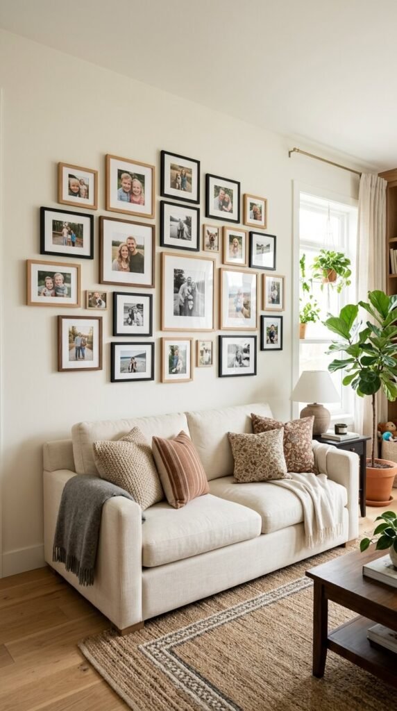
The goal of textural decorating isn’t fullness — it’s richness. A room with five well-chosen textures will always feel more sophisticated than one with fifteen competing ones.
Texture is one of the most powerful (and most underused) tools in home decorating. It doesn’t require a big budget or a total room overhaul — just a more intentional eye for materials, contrast, and restraint.
Save this article for your next decorating project, and remember: depth doesn’t come from adding more. It comes from choosing better.