Checkered floors have been turning heads for centuries — and they still do. From grand ballrooms to tiny powder rooms, this pattern carries a kind of confident drama that few other design choices can match. Whether you’re restoring a Victorian home, designing a retro diner kitchen, or just want one bold statement in a rented apartment, there’s a checkered style that fits your space, your budget, and your personality. These 28 classic interpretations show just how wide the range really is.
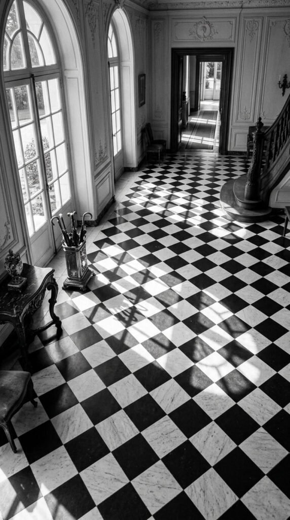
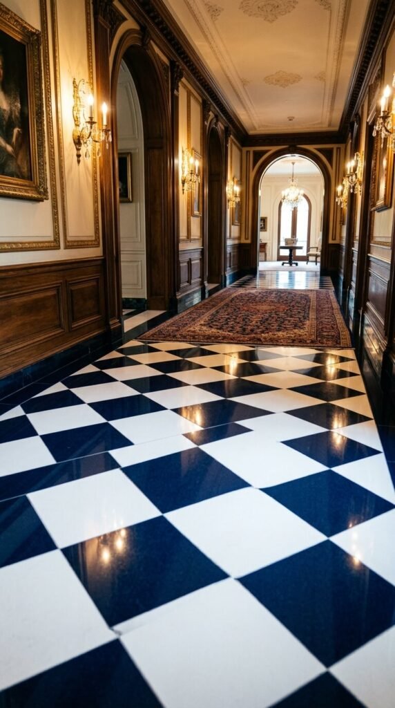
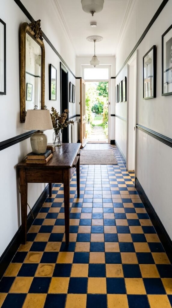
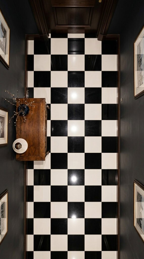
1. Classic Black and White Marble Checkers
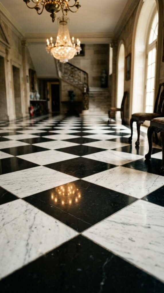
This is the original. Black and white marble checkers have appeared in palaces, banks, and manor houses for hundreds of years. The look is bold but timeless — it never feels trendy because it never went out of style. Genuine marble is expensive, but porcelain lookalikes cost a fraction and are nearly indistinguishable once installed. For a DIY approach, peel-and-stick vinyl tiles in this pattern work well in low-traffic rooms like a half bath or laundry room. Start small. Even a 4×4 foot entryway transforms completely with this pattern underfoot.
2. Tiny Mosaic Checkers in a Bathroom
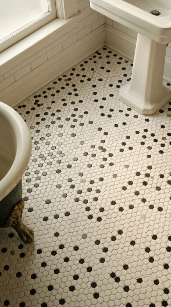
Small-scale mosaic checkers feel more delicate than their full-tile counterparts. They’re a classic choice for bathrooms, especially in homes with any historical character. Mesh-backed mosaic sheets make DIY installation surprisingly manageable — no need to place individual tiles one by one. A standard 5×8 bathroom floor can be done in a weekend. Look for penny-round or 1-inch square mosaic sheets at tile outlets or online clearance sales. White grout keeps things crisp; gray grout softens the contrast for a more aged, worn-in look.
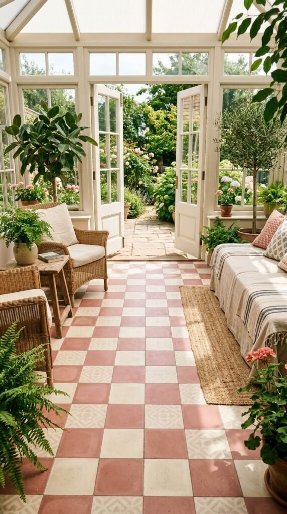
3. Warm Terracotta and Cream Checkers
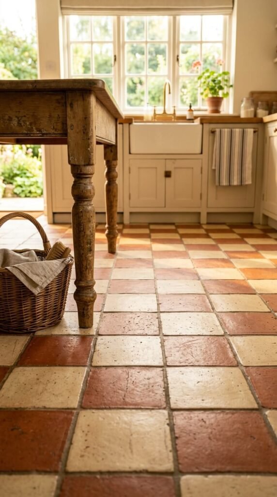
Not every checkered floor needs to be black and white. Terracotta and cream is a warmer, earthier alternative that suits Mediterranean kitchens, sunrooms, and rustic cottages beautifully. Real terracotta tiles are affordable and age gorgeously — they develop a patina over time. Seal them well to prevent staining. For a budget version, glazed ceramic in warm red-orange tones works just as well and requires no sealing. Pair with whitewashed walls and open wood shelving for a look that feels sun-soaked and unhurried.
4. Harlequin Diamond Pattern
The harlequin is checkers rotated 45 degrees. That single shift completely changes the energy of the pattern. Diamonds feel more dynamic and theatrical than straight squares. This works particularly well in long hallways where the diagonal lines draw the eye forward. Navy and white is a striking color combination here — strong enough to hold its own against bold wall colors. For DIY, cutting tiles at 45-degree angles requires a wet saw, but pre-cut diamond tiles are available from most specialty tile suppliers and skip that step entirely.
5. Faded Antique Checkers with Worn Grout
New floors can look too perfect. Sometimes the character is in the imperfection. Intentionally aged or distressed tiles mimic the look of floors that have been walked on for a century. Many tile companies sell pre-aged or hand-finished ceramic tiles specifically for this aesthetic. For a DIY trick, apply a gray-tinted grout and wipe the tile faces slightly before fully cleaning — it leaves a subtle shadow in the surface texture. Combine with other vintage details like exposed beams or mismatched antique furniture for a lived-in, storytelling space.
6. Diner-Style Red and White Checkers
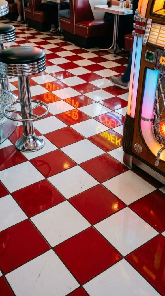
Red and white checkers scream 1950s Americana. This is a joyful, playful floor choice for kitchens, game rooms, or any space where you want personality over polish. Vinyl composite tiles in red and white are extremely affordable — often under $1 per square foot — and are built to handle heavy foot traffic. They’re also forgiving for first-time DIYers. Go glossy for the full diner effect. Add chrome accents, bar stools, and pendant lights to lean into the era. Or contrast it with modern matte furniture to create intentional tension.
7. Sage Green and Off-White Vintage Checkers
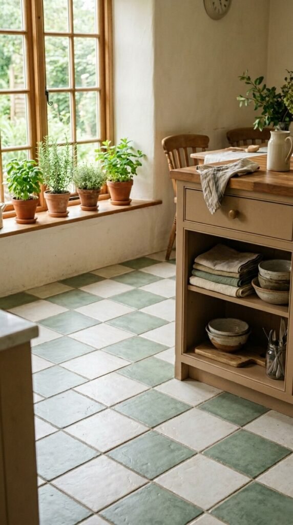
Sage green checkers feel nostalgic without being overwhelming. This color combination is softer than black and white, making it a good fit for kitchens and breakfast rooms where you want comfort over drama. Matte tiles in sage and cream look better than glossy here — they absorb light rather than reflect it, giving a quieter, more grounded feel. This palette pairs naturally with unlacquered brass hardware, vintage wooden furniture, and white linen. Easy to DIY with standard square ceramic tiles and a natural gray grout to tie both tones together.
8. Bold Navy and Mustard Checkers
This color pairing feels Art Deco and alive. Navy and mustard together have a graphic energy that turns a floor into a statement piece. It works especially well in hallways and entryways where guests see it first. Ceramic tiles in both colors are available from most large tile retailers. Grout in charcoal or deep gray ties the palette together without muddying it. Keep walls simple — white or cream — so the floor can do all the talking. This is a floor people will comment on every single time.
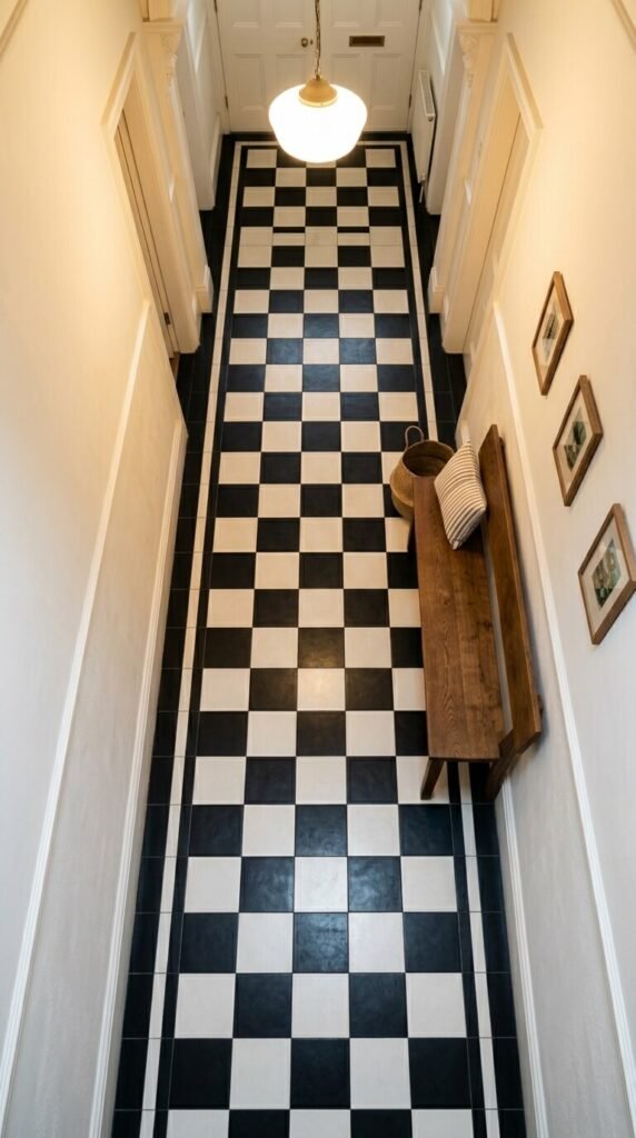
9. Tiny Black and White Kitchen Checkers
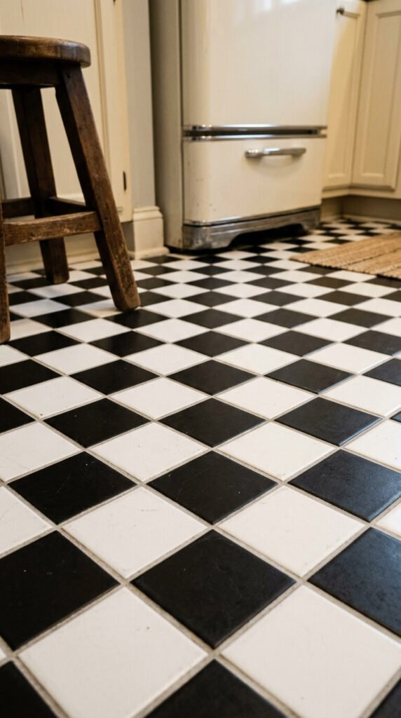
Smaller tiles in a classic kitchen setting create a denser, more intricate visual pattern without requiring any special design skills. Four-inch or six-inch tiles feel more traditional than the large-format versions you’d find in modern designs. This size is also forgiving in terms of installation — fewer cuts needed around cabinets and appliances. Stick to matte black and bright white for the crispest look. For a rental-friendly approach, removable peel-and-stick tiles in this pattern are widely available and leave no permanent adhesive behind.
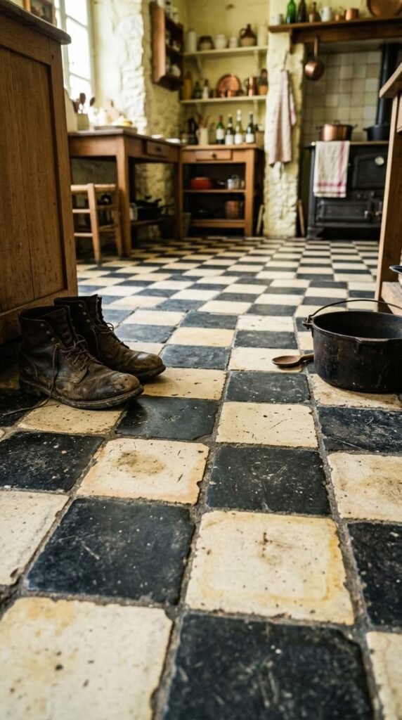
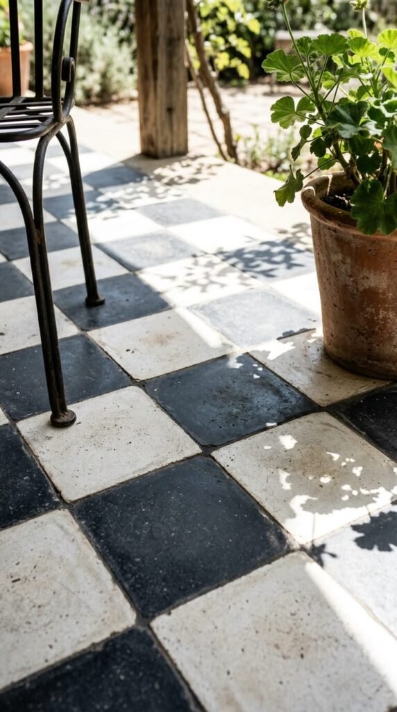
10. Reclaimed Stone Checker in an Entryway
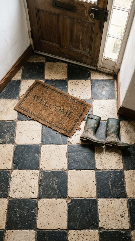
Reclaimed stone checkers carry genuine history. No two reclaimed tiles are exactly the same, which gives this floor a richness that new materials simply can’t fake. Limestone and slate are a classic pairing — warm against cool, rough against smooth. Salvage yards and architectural reclaim dealers are the places to look. Prices vary widely, but you can often find reclaimed stone for less than you’d expect, especially for smaller projects. This floor suits entryways perfectly — it can handle grit, mud, and heavy shoes while looking more beautiful with every passing year.
11. Penny Tile Checkers in Soft Monochrome
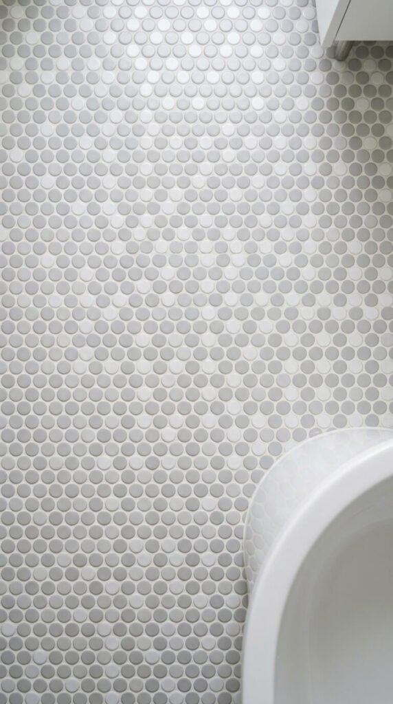
Penny tile arranged in a checker grid is a clever twist on a traditional format. Because the tiles are round, the pattern is implied rather than rigid — it reads as checkered from a distance but dissolves into texture up close. This dual-scale effect is subtle and sophisticated. Gray and white is a safe, elegant choice for bathrooms. Mesh-backed sheets make installation realistic for a confident DIYer. Use unsanded grout for the narrow joints. The result feels both vintage and restrained — nothing loud about it, just quietly interesting.
12. Encaustic Cement Tile Checkers
Encaustic cement tiles are made by hand and show it — in the best way. Each tile has slight color variation, surface texture, and a matte depth that machine-made tiles can’t replicate. They’re a premium product, but they last for decades and only get better with age. Seal them before grouting and re-seal annually in high-traffic areas. They suit kitchens, bathrooms, entryways, and covered outdoor spaces equally well. For a budget version, many manufacturers now produce porcelain tiles with printed encaustic-style surfaces that look remarkably close to the real thing.
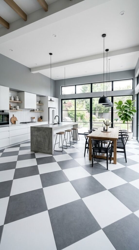
13. Large-Format Black and Gray Checkers
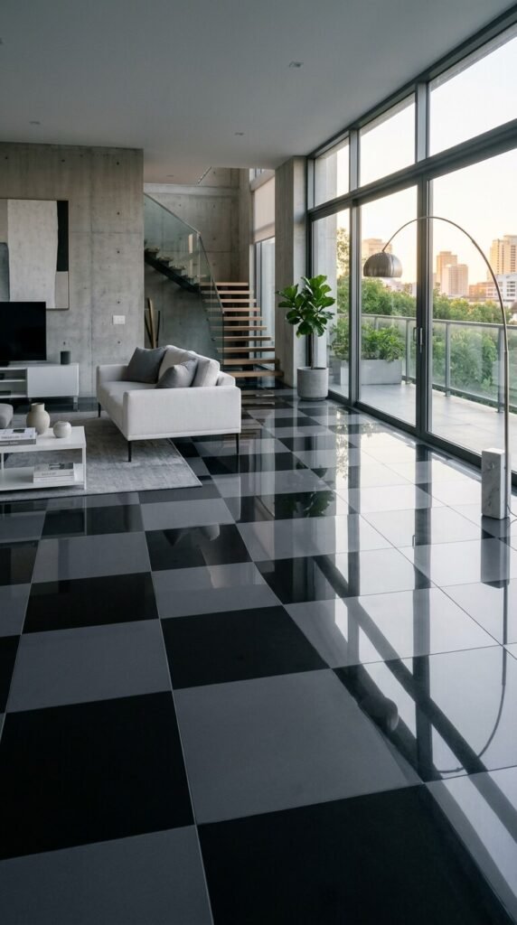
When you scale up the tile size, the pattern slows down. Large-format tiles in black and charcoal feel modern and architectural rather than vintage. The contrast between the two dark shades is subtle — it’s a floor that rewards a second look. This works well in open-plan living areas, especially with concrete, steel, or white plaster walls. Big tiles also mean fewer grout lines, which makes cleaning easier. Use a large-format tile cutter or hire a tile setter for a clean result — cuts need to be precise at this scale.
14. Checkers with a Contrasting Border
A border turns a simple checkered floor into something that feels custom and considered. A solid border in the darker of the two tile colors frames the pattern like a picture frame — it gives the floor a defined edge and a more formal finish. This works especially well in entryways and dining rooms where the floor is a clearly defined zone. Adding a border typically requires more planning and more cuts, but the result looks far more intentional. Measure and mark your border lines before you lay a single tile.
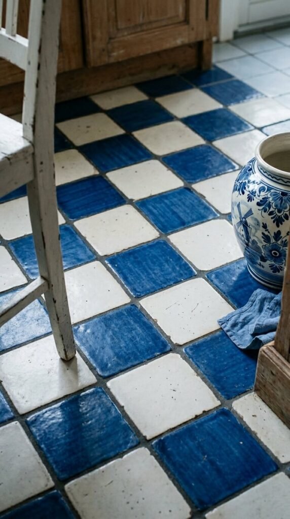
15. Vintage Blue and White Delft-Style Checkers
Delft-style tiles bring European heritage into a checkered format. Alternating solid white tiles with hand-painted blue patterned ones gives the grid a layered quality — each square tells a slightly different story. This works best in kitchens and dining spaces that lean toward a European country aesthetic. Authentic Delft tiles from Dutch makers are available online, though pricier. Many retailers offer lookalike versions at a fraction of the cost. Even a single decorative tile accent mixed into a plain blue-and-white grid adds significant character without the full expense.
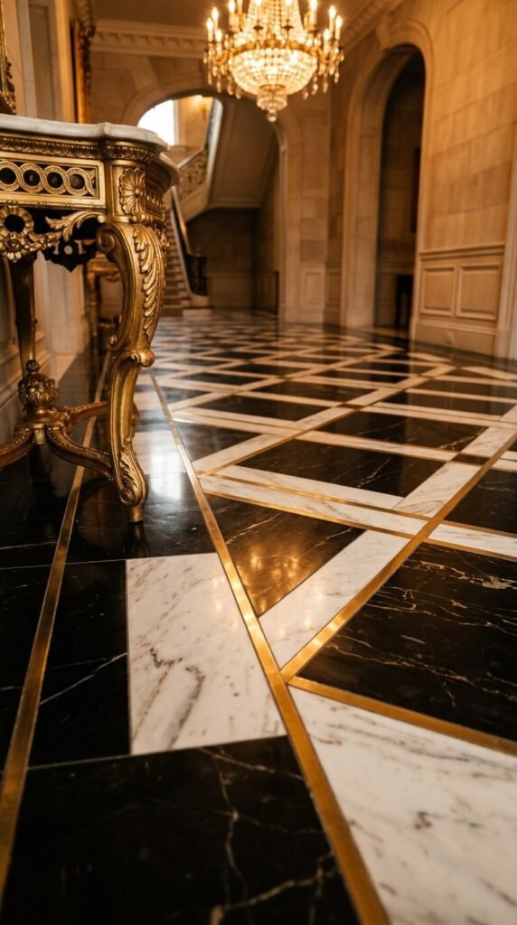
16. Black and White Checkers with Brass Inlay
Thin metal inlay between tiles is a finishing detail that changes everything. Brass strips between black and white tiles add warmth to what might otherwise be a cold, graphic pattern. The metal also creates a visual grid that makes grout lines almost invisible. This is a technique more common in high-end residential and hotel design, but prefabricated metal edge strips are available to DIYers willing to take their time. Pair with gold-toned fixtures and dark wood furniture to carry the warmth upward from the floor.
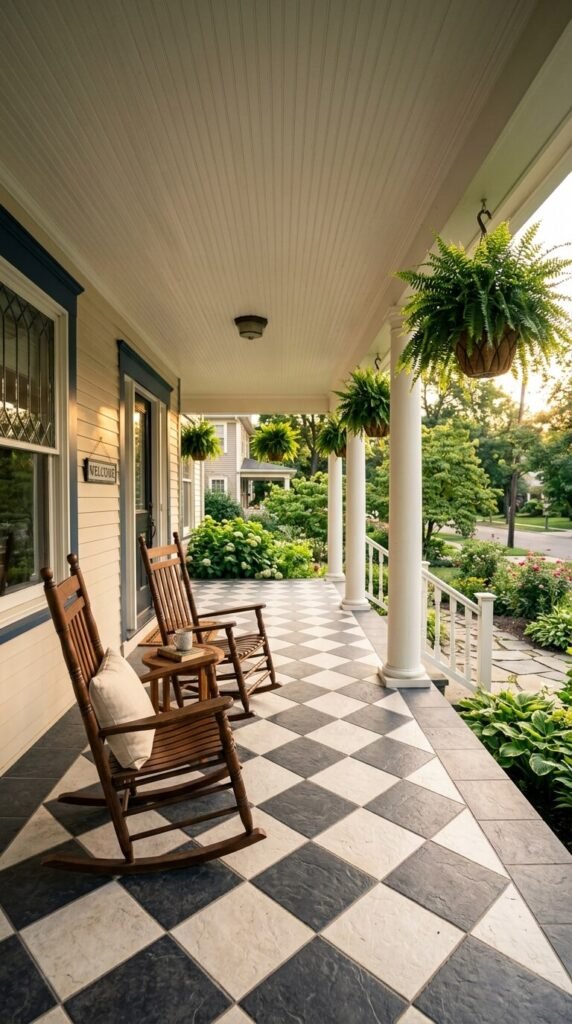
17. Outdoor Checkered Patio Tiles
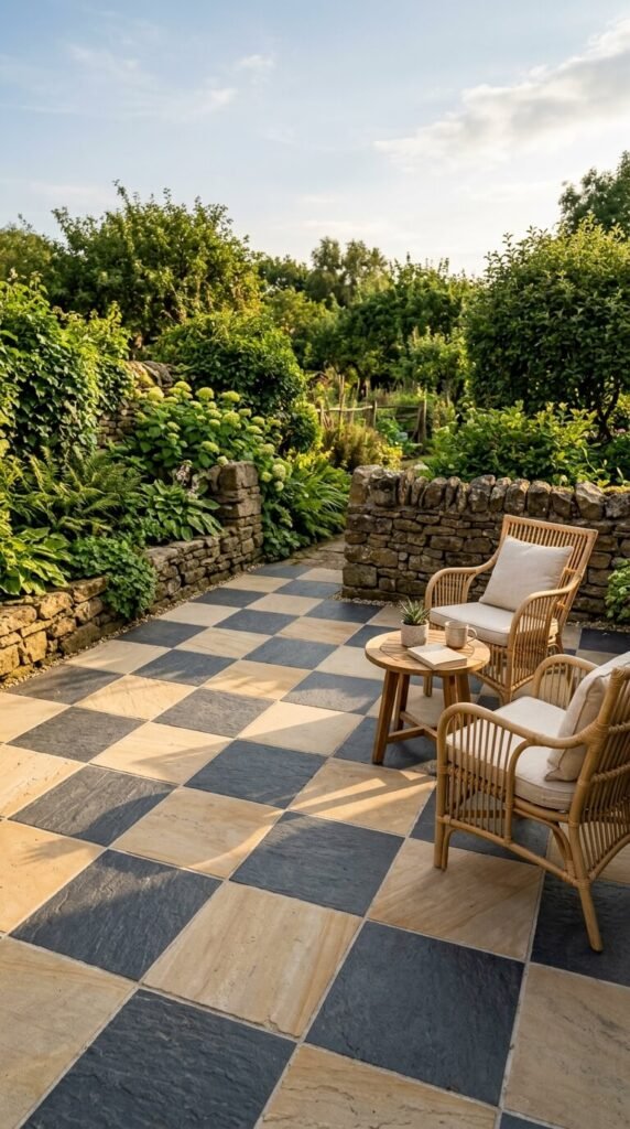
Checkers work outside too. Outdoor-rated porcelain in a checkered pattern can completely transform a patio, covered porch, or entryway landing. Choose tiles rated for outdoor use — they’re frost-resistant and textured enough to prevent slipping when wet. Charcoal and sandstone is a natural-looking palette that blends with garden settings. Darker grout handles outdoor grime far better than white. For a budget patio project, concrete pavers alternated in two tones create the same effect at a lower cost per square foot.
18. Checkerboard in a Laundry Room
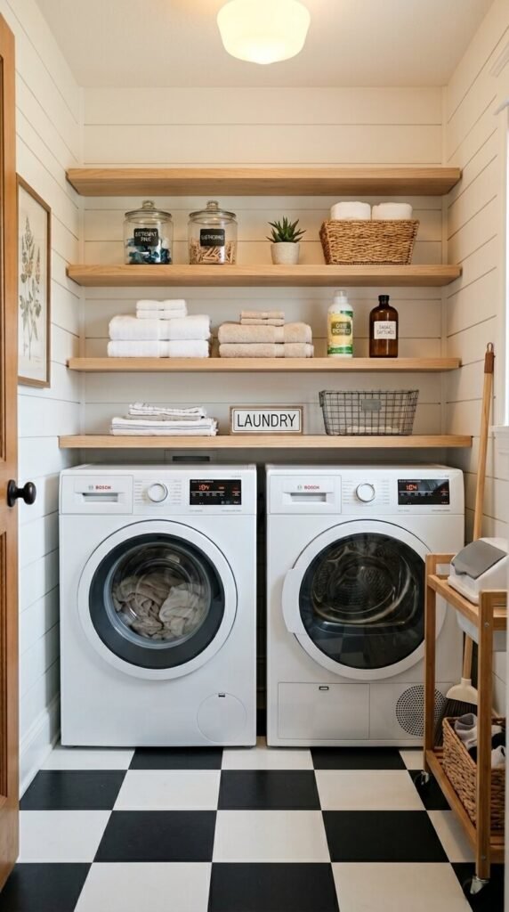
The laundry room is one of the best places to be bold. Nobody is decorating around it, so you can take risks you might not take in a main living area. Peel-and-stick vinyl checkers are perfect here — they’re waterproof, easy to install, and completely renter-friendly. A black and white pattern makes even a tiny laundry closet feel intentional and designed. Replace them whenever you want a change. Add a painted wood shelf and a vintage-style utility sink to make the whole space feel more like a designed room than an afterthought.
19. Sage and Charcoal Checkers in a Mudroom
Sage and charcoal is a color combination that handles the demands of a mudroom gracefully. Charcoal hides dirt while sage adds warmth and personality. Matte porcelain is the right material here — it’s slip-resistant and easy to mop. This palette also pairs well with natural wood cubbies, black hooks, and warm-toned storage baskets. If you’re building a new mudroom or renovating, tile the floor with these colors before you install any built-ins — it sets a tone that everything else can follow.
20. Vintage Linoleum Checkers
Real linoleum — not vinyl, actual linseed-oil-based linoleum — is having a quiet revival. It’s sustainable, long-lasting, and comes in checkered patterns that look authentically mid-century. Marmoleum is the most widely available brand and offers an impressive range of colors. It’s also naturally antimicrobial, which makes it a sensible kitchen floor. Installation requires some skill, as linoleum sheets need to be cut precisely and bonded to the subfloor. If DIY feels like too much, most flooring contractors can install it affordably. The finished result looks like history — in the best sense.
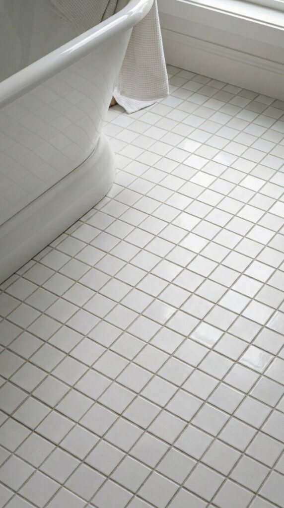
21. White-on-White Subtle Checkers

Two whites. One matte, one glossy. That’s the entire palette. The contrast is barely there — you notice it when light catches the floor at an angle, and then it’s quietly stunning. This works in bathrooms where you want texture without color, pattern without noise. It’s a design choice that feels considered and calm. Look for tiles from the same manufacturer in matched matte and gloss finishes so the sizes and edges align perfectly. Use white grout to keep the surface looking seamless. The result is a floor that whispers rather than shouts.
22. Encaustic-Style Checkers in a Sunroom
A sunroom is where you can afford to be playful with color. Dusty rose and cream checkers in an encaustic style feel effortlessly romantic — like a French country house that’s been sitting in the sun for decades. Porcelain tiles printed with an encaustic-style surface give this look at a fraction of the cost of real cement tiles. The sunroom’s natural light will shift how the colors read throughout the day, which is part of the charm. Pair with rattan, linen, and potted ferns to finish the picture.
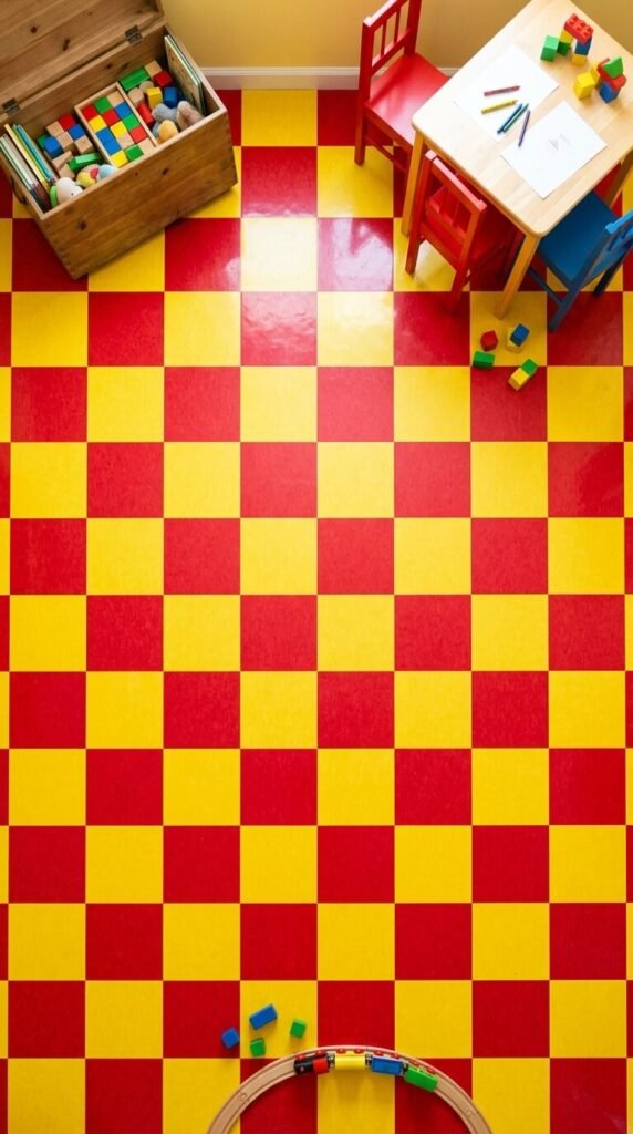
23. Checkers in a Kids’ Playroom
Color goes a long way in a playroom. Red and yellow checkers are joyful, stimulating, and completely appropriate for a room dedicated to play. Vinyl or rubber flooring tiles in bright colors are the practical choice — they’re soft underfoot, easy to clean, and take real punishment. Many interlocking foam tile systems come in checkered color combinations and can be assembled by one adult with no tools and no mess. The tiles can be rearranged, added to, or removed when the kids grow up and the room changes purpose.
24. Gray and White Modern Checkers
Gray softens the drama of classic black and white without losing the pattern’s structure. Light gray and white tiles create a calm, modern floor that suits open-plan kitchens and living rooms where you want interest without visual competition. This palette is especially forgiving if your space gets a lot of traffic — fingerprints and scuff marks that would show on white grout are much less visible with gray. Use a mid-tone gray grout to tie the two tile colors together. The result is mature, quiet, and stylish without trying too hard.
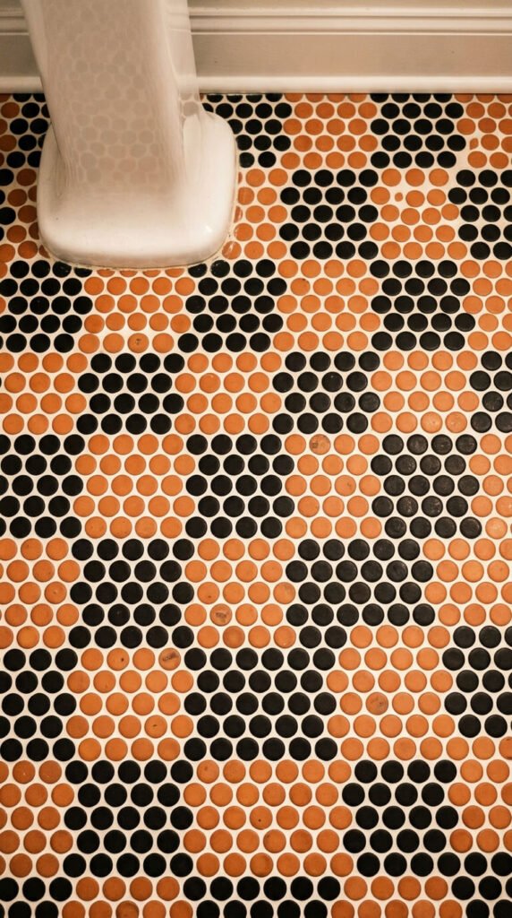
25. Penny Tile Checker in Black and Terracotta
Black and terracotta is an unexpected color pair that feels both modern and earthy. In penny tile format, the two colors create a soft, organic checkered pattern that has personality without feeling aggressive. This works particularly well in bathrooms with warm wood tones, unlacquered brass, and cream walls. Terracotta penny tiles are available in glazed ceramic, which is more practical than unglazed in a wet room. Use a cream or light beige grout rather than white — it softens the contrast and brings the warmth forward.
26. Jet Black and Ivory Wide-Set Checkers
Bigger tiles, stronger contrast, more impact. Jet black paired with true ivory — not pure white — gives the classic checker a richer, slightly softer quality. Ivory reads as warmer than white, which takes the edge off a very high-contrast floor. At 18 or 24 inches per tile, the pattern moves more slowly and feels more architectural. Polished porcelain amplifies everything — the contrast, the reflections, the sense of scale. This is the version for grand spaces: wide hallways, large dining rooms, double-height foyers.
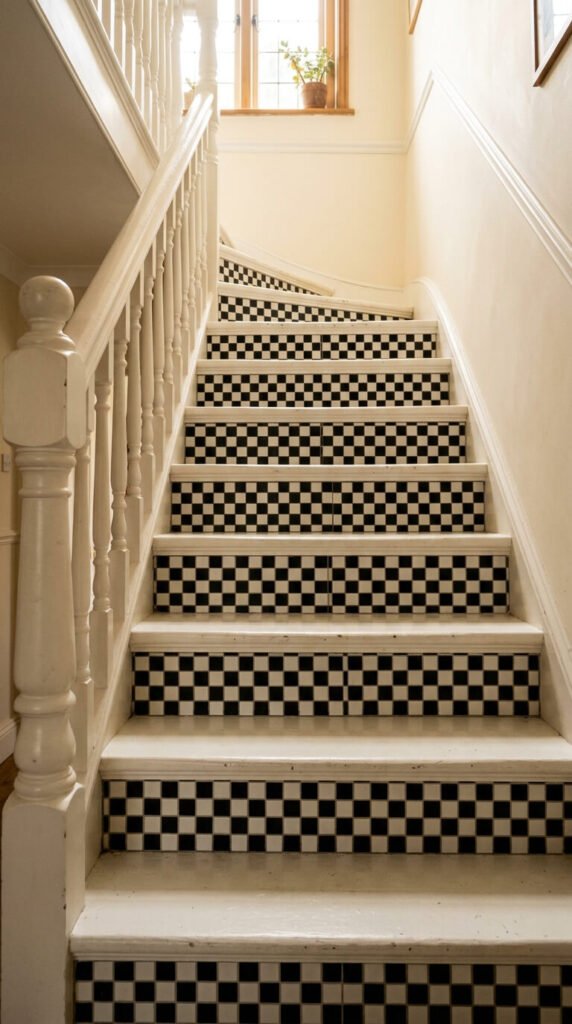
27. Checkerboard Stair Risers
Checkers don’t have to live on floors. Tiled stair risers in a black and white checkered pattern are a clever, unexpected detail that transforms a plain staircase into a design moment. Only the vertical face of each step needs tiling — the treads stay plain wood or carpet as usual. Small mosaic tiles in sheet form make this a manageable DIY project. The tile area per riser is small, so even premium tiles stay affordable. It’s a detail guests notice immediately, and it looks far more labor-intensive than it actually is.
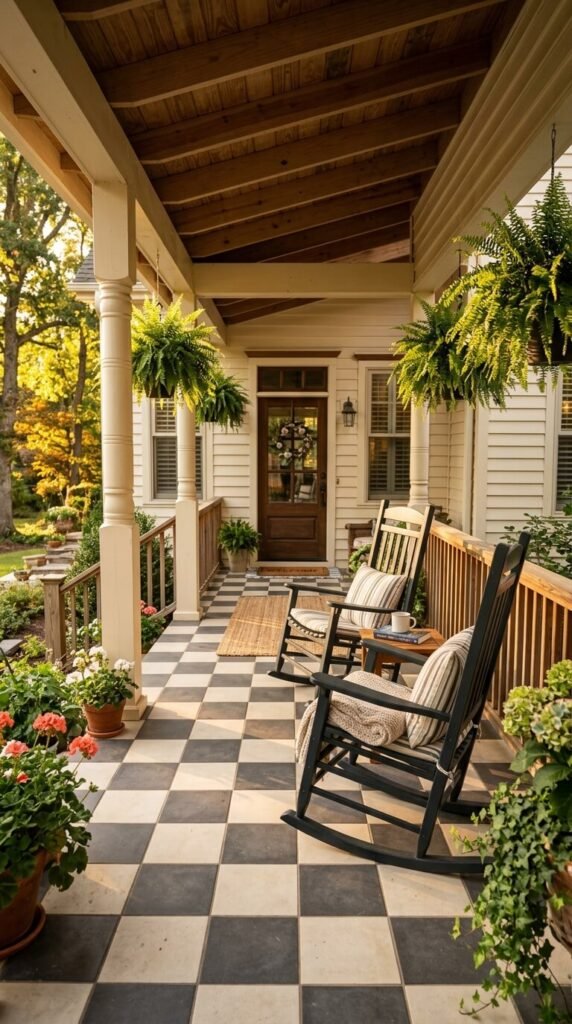
28. Two-Tone Cement Checker on a Covered Porch
The covered porch is where checkered floors feel most at home historically. Two-tone cement tiles in charcoal and warm white recall a design tradition that goes back well over a century in American residential architecture. Cement tiles are porous and need sealing outdoors, but they handle shade and weather well when properly maintained. Re-seal every year or two. The slightly rough surface texture is also naturally slip-resistant — a practical advantage on an outdoor floor that gets rain and wet feet. Pair with painted wood porch swings and hanging ferns for the full effect.
Conclusion
Checkered floors carry more creative range than most people give them credit for. They can be loud or quiet, historic or contemporary, inexpensive or investment-grade — it all depends on the tile size, the color pairing, and the space they inhabit. What connects every version on this list is a kind of visual confidence. A checkered floor commits. It makes a choice and owns it. Whether you go bold with red and white vinyl in a diner kitchen, subtle with matte-on-matte white in a bathroom, or grand with black marble in an entryway, the pattern rewards decisiveness. Pick the version that fits your space and your means — then go ahead and lay it down.